More
Turn on suggestions
Auto-suggest helps you quickly narrow down your search results by suggesting possible matches as you type.
- Atlas
- /
- Atlas Hub
- /
- Khoros Kudos Awards
- /
- Past Lithys
- /
- Lithys 2017: Tesco Bank- Digital Design Excellence
Options
- Subscribe to RSS Feed
- Mark as New
- Mark as Read
- Bookmark
- Subscribe
- Printer Friendly Page
- Report Inappropriate Content
Lithys 2017: Tesco Bank- Digital Design Excellence
Our vision is to be the bank for people who shop at Tesco. We believe that every little help makes a big difference.
---------------------
Company: Tesco Bank
Entry submitted by: Jamie Johnston (Community & Content Strategist)
Community: Your Community From Tesco Bank
Lithy category: Digital Design Excellence
Our vision is to be the bank for people who shop at Tesco. We pride ourselves on our range of simple and convenient retail banking and insurance products designed specifically to meet the needs of Tesco customers. We believe that every little help makes a big difference.
Tesco Bank is a wholly-owned subsidiary of Tesco, which gives us the freedom to make decisions based on what we think is best for our customers. Our core purpose is a clear and simple statement of what we do and what we stand for: to serve Britain's shoppers a little better every day.
Our digital goals with our Lithium-powered community platform
Our core Brand purpose is: We believe that every little help makes a big difference.
Our primary digital goal is to offer better self-service options for customers. That means moving from a traditionally reactive position in terms of Help and Support for customers to one where we more quickly identify trends and then surface relevant answers to meet this demand – simply and helpfully.
Secondary is to provide useful and helpful content based on consumer searches and queries, giving both existing and prospect customers a new reason to visit our digital channels – as we help them with financial matters, whether they are a Tesco customer or not.
Stage one was to make our Community fully responsive so it can be enjoyed and used to its fullest on all devices (increasing Mobile participation) for help and support – this has just been completed in late March 2017.
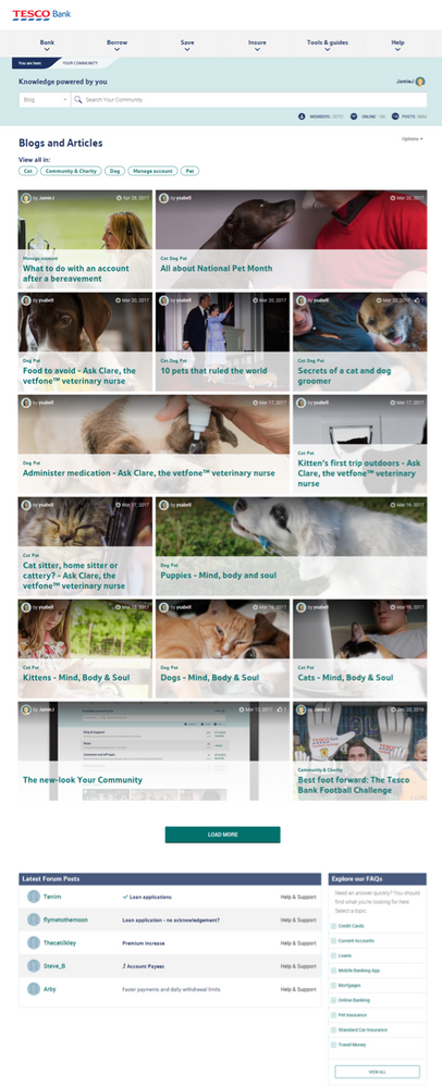
At the same time we also redesigned our instance of the Blog to make it more visually appealing and highlight its presence better on our main landing page – providing the first set of helpful content.
We used and inherited the style guide of Tescobank.com to ensure a consistent user experience between Community and website.
The 2017 Lithys have come too early for Stage two! But later this year we will be looking to build a hub of helpful content on our website, with Community and Social supporting the outreach. For help and support we want to dynamically surface Community content on our other digital channels (website, mobile app) and move away from the current static set of corporate FAQs on both these channels.
Our unique design elements
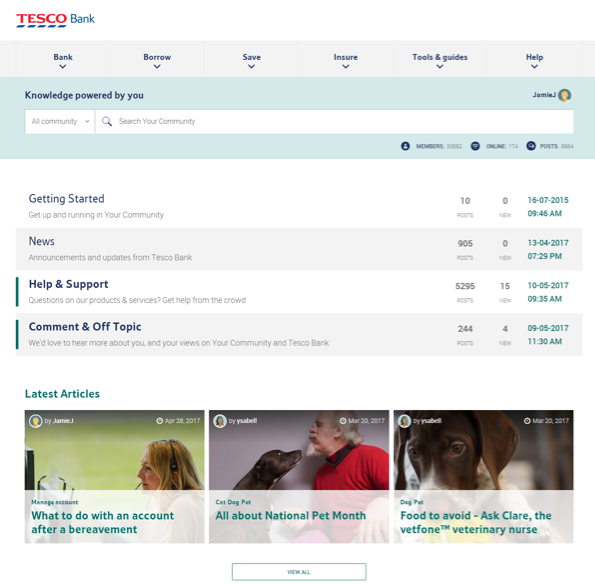
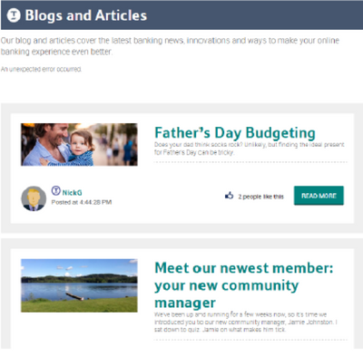
We included visually appealing thumbnails to make our Blog content stand out from the Forum experience, and direct users to it clearly.
But we also made sure to prioritise the Forums above this, as we began as a Help Forum – and this is the Community’s primary goal.
We reduced the number of Forum boards to provide clarity and ease in finding the right place to post in.
Previous community homepage
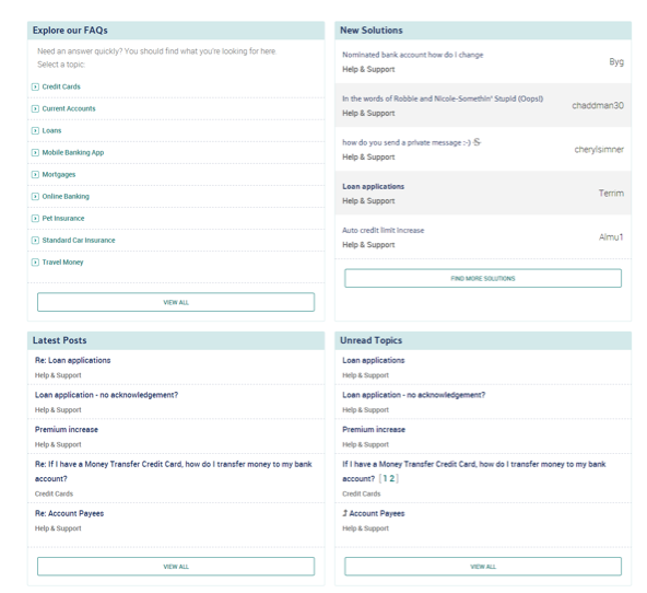
New community homepage
How we executed our design
We had initially started out to build an entire hub of new helpful content, so there was a large portion of user studies and tests carried out on what would be in there, and how it would be accessed.
Over time it was decided to build this main hub in our website, but we used the user tests to validate the redesign of the Community Blog – our first delivery in providing helpful and relevant content for customers above and beyond just transactional help and support.
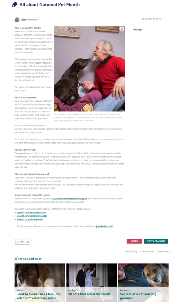
As well as user studies, we looked at competitors and other instances of blog-style content, resulting in a tiled Blog landing page, with simple categories to filter the results. And after viewing an article, some suggestions for further reading based on the categories set up.
Once we had the UI designed internally we then partnered with Lithium to build and deliver it.
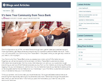
Previous blog landing page & article
New Blog landing page & article
Metrics to showcase our design excellence
It is still very early days since the responsive redesign to understand the overall impact to visits and engagement.
However, our primary goal with the redesign was to ensure a fuller and richer experience for Mobile users.
And the metrics seem to back an improvement in Mobile engagement with the proportion of mobile visits to overall visits on an upward trend since launch (March 24th) as per the graph below:
05-10-2017
07:03 PM



You must be a registered user to add a comment. If you've already registered, sign in. Otherwise, register and sign in.