Lithys 2013: Joe Mobile - Best Community Design
Company: Joe Mobile
Entry submitted by: Laurent Partouche (lpartouche) Community Manager
Community: Joe Community (communaute.joemobile.fr)
Lithy category: Best Community Design
___________________________________________________________________

The community is at the heart of Joe Mobile's website because it is very much the key to its success and its low-cost business model.
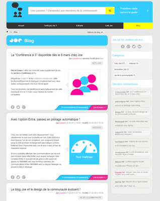
It was clear from the beginning that Joe's community should take center stage in our otherwise very lean website. Hence on Joe's homepage the community link sits in the header's navigation bar, a search field module appears in the middle just above the latest conversations module, and the blog finally rests on the lower right side, just above the fold.
The customer is welcomed via its pseudo and a ticker that notifies him of any unread messages.
You just can't miss that Joe is serious about being a community-based service. But that's not enough. Joe's business model lies on the fact that the community should be in charge of the first-level consumer support. We don't have any call centers, just a limited number of agents that use a form-based tool to deal with the most complicated requests.
For this to work, you need to organize the community space so that the customer, who often comes here for the first time, knows instantly what he is supposed to do to find the answer he is looking for.
We have worked hard on the design to ensure that a newbie would find his way. This is how it's done :

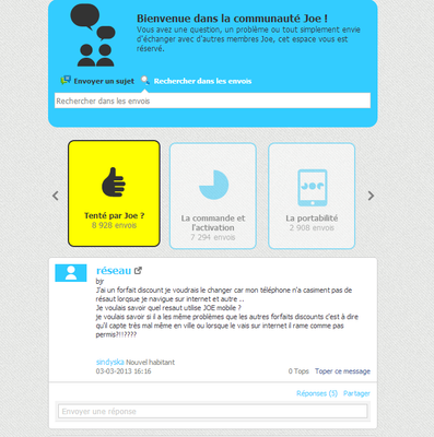
People are very used to searching the google way, it's just the same with Joe. Chances are your question has already been asked…and answered already so Search should be your first stop.
A horizontal community nav bar
This design moves away from the commonly accepted best practices for new communities. However, knowing that it could be risky, we decided to go along with this horizontal design that clearly separate the section for prospective customers, who mostly have questions about our services and how to join, from the section for current customers who need help when activating their number or a more technical issue related to phone or the network.
A cozy place to chat
Joe's community is about support, about people helping each other out. But rather than using the Q&A style module that could have been well suited for this purpose, we went along with a regular board design. This choice allows for longer discussions between members sometimes long after the correct answer has been given and validated since we never close subjects. We also dedicated a space, the Café Joe, for pure off-topic discussions and where new users can introduce themselves to the community.
This design is a success!
With 30,000 searches per month and 17,000 posts for 1400 new topics, the community is thriving.
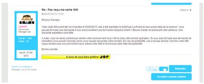
All section are very well balanced and we mad sure that "approved solutions" would be very visible both in the live search bar and the posts to be as precise as possible for anyone having a question about Joe.
We just added The Facebook integration for the community again using the Facebook studio tools provided by lithium. This allows to open the community to a broader audience whilst retaining the same design principles that have worked for us so far.
Good design is key to a successful website. It is even more important when you service depends on the efficiency of the community. Forums can be messy and overloaded, a well-thought design is critical to give customers both a feeling of liveliness that brings a more emotional touch to your operation but also a efficient tool to very rapidly answer any question.


