How We Built It: Custom Community Banners
Custom community banners are a great way to enhance the user experience throughout your Community. In Atlas, we use custom content to draw attention to important features, direct users to useful pages, and share news from our team. In this post, we take a look at some of the ways you can leverage Khoros Communities' Custom Content features to enhance your user's experience. You can customize Custom Content with a little scripting in several ways: Show or hide the component based on the user's role(s) Add CSS styling unique to the component Display images hosted externally or through your Community's Asset Library Direct users to a specific link or area of your Community In this example exercise, we're adding the banner (below) to our community's pages. We will go through the process of uploading the image asset, creating the custom content, and adding the Custom Content component to our Community Page's quilt. Upload Image Assets to your Community We start with a simple PNG image that we want to display in the custom community banner. This image file needs to be hosted somewhere. This could be an external hosting arrangement, or directly hosted from within your community using the Community Asset Library. You can upload image assets to the Asset Library by doing the following: Go to Studio > Community Style Tab. Select Asset Library from the Work With drop-down menu. Click the Other Assets tab. Click the Choose File button and select the file you want to upload. Click Upload. After you have uploaded the new asset, you can locate the file in the list and discover its unique URL. Make note of this URL since you will need it when crafting the Custom Content in the next step. In our example, our file is located at /html/assets/thankyou2.png. Add Custom Content to the Quilt This last step is pretty straightforward. We need to add our new Custom Content to the quilt for the page(s) we want the banner to appear on. In our example, we're adding it to the Community Page. Here's how: Go to Studio > Page. Expand the Custom Content area of the Components list. Select the Custom Content item you want to use for this banner by clicking the plus (+) symbol next to it as you hover over it with the cursor. Drag the Custom Content component to the area of the quilt in which you want the banner to display. Scroll down to the bottom of the page and click Save. Once you have configured the custom content, your new custom community banner should appear where you configured it to go and for the users with the role(s) you specify in the content's scripting. Create Custom Content Now that you have the image asset(s) you want to display in the custom community banner uploaded, you can create the custom content that the image(s) will be displayed through. Here's how: Go to Community Admin > Content > Custom Content. Select a Custom Content Setting that… 999ViewsSign in to react to this post
 1Comment
How We Built It: Since you were gone component
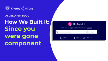
Overview This article explains how to build a custom component and attach it to the community hero element on your community home page. You can add this custom component to any element based on your preference. This custom component fetches recent notifications when the user is not signed in to the community. These recent notifications are rendered on your community home page based on whether the user is anonymous or registered. The purpose of this component is to notify visitors about recent activities performed on the user account for registered users and for anonymous users, a custom text based on your preference will be displayed. Building the Since you were gone component is done in three steps: Creating a custom component walkthrough Assigning the custom elements with custom text Adding the custom component to your community homepage Here is an image of the Since you were gone component in Atlas Community: Creating a custom component walkthrough Create a new custom component in Studio named since_you_were_gone (Studio > Component > New component). To add the below custom component code snippet, you must have community admin permission. <#if user.anonymous> <div class="hero-desc hero-desc-space-style"> <span>${text.format("custom.hero-desc.anonymous")}</span> <a href='${webUi.getUserRegistrationPageUrl("/")}'>${text.format("custom.hero-desc.anonymous.joinus")}</a> </div> <#else> <#assign notifications = rest("/users/self/notifications/unread/count").value?number/> <#assign notificationfeedCount = liql("SELECT count(*) FROM notification_feeds" )/> <#assign num=notificationfeedCount.data.count?number/> <#if (num> 0) && (notifications>0) > <div class="hero-desc hero-desc-space-style"> <div class="since">${text.format("custom.hero-desc.loggedin")}</div> <#attempt> <@component id="notificationfeed.notificationList" lazyLoad="true" /> <#recover> </#attempt> </div> <#else> <div class="hero-desc hero-desc-space-style"> <div class="hero-desc hero-desc-space-style">${text.format("custom.hero-desc.no.recent.notification")}</div> </div> </#if> </#if> We are going to break down the code into six sections. Section 1 (Line 1-6) <#if user.anonymous> <div class="hero-desc hero-desc-space-style"> <span>${text.format("custom.hero-desc.anonymous")}</span> <a href='${webUi.getUserRegistrationPageUrl("/")}'>${text.format("custom.hero-desc.anonymous.joinus")}</a> </div> <#else> If user.anonymous is true, then proceed. The remainder of the component code is contained in this if statement. If user.anonymous is not true, the…1.8KViewsSign in to react to this post7CommentsHow We Built It: User Profile Hover Card
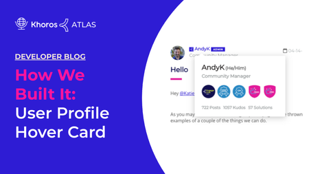
Overview User Profile Hover Card is used to display user information such as pronouns, roles, number of posts, kudos, and solutions. With the User Profile Hover Card, you see user information while viewing any article in your community by hovering your mouse cursor over either their avatar or the user name. Note: The User Profile Hover Card will not be displayed in the user profile. A JavaScript function will be attached to certain elements on the page that makes an AJAX call to the server when the mousenter event is triggered. This AJAX call request will return all the information necessary to display a hovercard with the user profile information. You can create a Profile Hover Card using these three steps covered in this guide. Building an endpoint Creating a custom javascript function Adding a javascript function to a quilt to display the user information Here is an image of the User Profile Hover Card in Atlas Community: Building the endpoint Create a new endpoint in Studio named profile-card (Studio > Endpoints > New Endpoint). Here is the overall structure of our code. After some initialization code and setting up some variables, we have two main steps outlined in the comments. <#compress> <#-- Set up number format and import some functions you will use later on --> <#setting number_format="0.######"/> <#include "theme-lib.common-functions" /> <#-- The user whose profile information we would like to display --> <#assign userId = getRequestField("userId", "-1", true)?number /> <#assign unqId = getRequestField("unqId", "")?string /> <#assign badgeSize = 5 /> <#if userId gt 0 && validEndpointRequest(false, true,false)> <#-- Step 1. Make REST call for the data required for the component --> <#-- . . . see below code snippet . . . --> <#-- Step 2. Render the actual card markup --> <#-- . . . see below code snippet . . . --> </#if> </#compress> Step 1 To fetch the user’s profile information, we just need to write a LiQL request and make the request assigned to a variable. <#assign userQry = "SELECT login, view_href, rank.name, rank.color, user_badges FROM users WHERE id='${userId}'" /> <#assign userProfileData = executeLiQLQuery(userQry) /> Step 2 In step 2, we will use the data we just fetched to create some variables and return the markup required for the hovercard. <#if userProfileData?size gt 0> <#assign userProfileData = userProfileData[0] /> <div> <section> <span><span id="cardTitle-${unqId}"><a href="${userProfileData.view_href}">${(userProfileData.login)!""}</a></span> <span id="…728ViewsSign in to react to this post0CommentsHow We Built the TKB Audit Flow Part 3: Review Date Display
The Review Date Display component is the meat and potatoes of our KB Audit Flow solution on the front end. It's the component that visitors see, displaying the date the article was last reviewed by the team. It also checks the user's roles to determine if they have the specified role(s) to access the Audit checkbox which updates the last reviewed date. In this part of the KB Audit Flow series, we're going to create the Review Date Display Info component. We highly recommend reading the first two posts in this series to get a better understanding of the other components and prerequisites required for this component to function properly. How We Built the KB Audit Flow Pt. 1 How We Built the KB Audit Flow Pt. 2: Audit Checkbox Create the LastReviewedInfoTaplet.ftl file To get started, create a new file: /res/components/LastReviewedInfoTaplet.ftl. Note: These instructions cover the method for creating the component using the Community Plugin SDK. For an easier UI-based approach, we recommend using Studio to create the component. The content of the file below remains the same. Here are the contents of the new file: <style> .audited-component-checkbox{ margin-top: -20px; margin-bottom: 35px; } label.lia-form-label.audited-label-set { padding-top: 4px; font-weight: bold !important; float:left; } .litho-audited-checkbox-style{ float: left; } .lia-form-label-wrapper.audited-label-float{ float: left; } .lia-inline-confirm.confirm-label-float{ float: right; margin-top: 4px; margin-left: 12px; } a.litho-tkb-audited-deny { cursor: pointer; } a.litho-tkb-audited-approve { cursor: pointer; } .hide-article-component-here{ display:none; } </style> <#-- <#import "article" as com> --> <div class="hide-article-component-here"> <@component id="article"/> </div> <#assign message_uniqueId = -1 /> <#if env.context.message??> <#assign message_uniqueId = env.context.message.uniqueId /> <#assign lengthOfDomain = env.context.message.webUi.url?index_of("/t5") /> <#assign communityDomain = env.context.message.webUi.url?substring(0,lengthOfDomain) /> </#if> <#-- ${message_uniqueId} --> <#-- <div class="reload-lastReviewedComponent"> <@component id="LastReviewedInfoTaplet" /> </div> --> <#-- REST call to get the user's roles --> <#list restadmin("/users/id/${user.id?c}/roles").roles.role as role> <#-- Look for the role name you want to display content for --> <#if role.name?? && ( (role.name == "Administrator") || (role.name == "Documentation") )> <div class="audited-component-checkbox"> <div class="lia-quilt-row lia-quilt-row-standard lia-quilt-row-first lia-quilt-row-last"> <div class="lia-quilt-column lia-quilt-column-24 lia-quilt-column-single lia…576ViewsSign in to react to this post1CommentHow We Built It: Pronouns in User Profiles
A while back, Atlas added the ability for users to add personal pronouns to their user profile. You can read about this enhancement in Atlas Proudly Adds Pronouns Option to Profile. Today, we take a technical dive into how we added a Pronouns field on the Atlas user profile and registration page using a custom field setting and a custom component. Note: Customizations in your community might conflict with the implementation that we describe in this article. For example, if your community has removed the "Personal Information" tab in My Settings > Personal, you will not be able to add the pronouns to the Personal Information tab exactly as described here. Pronoun field on the User Registration page Pronoun field in the Personal Information tab Customization overview Create your Support ticket Create a redirect component Update attribute mappings in Community Admin (SSO-only) Use pronouns in customizations Pronoun field on the User Registration page Here is how the Pronoun field appears on the User Registration page. Pronoun field in the Personal Information tab Here is how the Pronoun field appears on the Personal Information tab under My Settings > Personal. We created a custom component to add an Update who can see your private info link under the field that redirects the user to the My Settings > Preferences > Privacy page to modify their pronoun privacy preference. We show the code for this link in Create a redirect component. Note: If your community had the Personal Information section removed from My Settings > Personal, you will need to consider asking Support to restore the Personal Information tab with just the Pronoun field or implement some other method for users to edit their personal pronouns through the community user interface. Customization overview Let's take a quick look at the customization as it was implemented on Atlas. You'll need Khoros Support to perform some back-end tasks and you'll also need to build a simple custom component. Important: Our implementation uses a non-SSO registration flow. If you're interested in trying this customization in an SSO community, be sure to read the next section for caveats and considerations. Developer/Community Manager tasks: Create a custom component that creates a redirect link to the user's Privacy Settings page so that they can control who can see their personal pronouns. File a Support ticket requesting back-end configurations Khoros Support tasks: Create a custom field setting where users can enter and modify their personal pronouns. Add the new field to the required page forms. Once the custom field is in place, you'll be able to access it via the Community REST API in FreeMarker customizations. NOTE TO KHOROS SUPPORT STAFF: See Add a custom pronoun field setting to the user profile for instructions relating to these enablement and configuration tasks. SSO …575ViewsSign in to react to this post0CommentsHow We Built It: Private Member Info component
We all know that protecting Community users' personal information is vital. That's why the most sensitive user profile data is visible only to users with the Administrator role. That said, a few profile fields enable Khoros staff members to troubleshoot questions better and help customers more effectively. On Atlas, we allow a select set of Khoros employees to see a user's email, company, first name, last name, and roles in a Private Member Info component. We display this component on the View Profile Page. Clearly, we don't want every Khoros employee to see this protected data. Therefore, we display the component only to users with a specific role. Today, we're going to walk through how our Atlas engineers built the Private Member Info component. Component workflow APIs used Code walkthrough How I tested it Custom CSS Annotated component code Component workflow The logical flow of our Private Member Info components looks like this: APIs used Our Private Member Info component uses FreeMarker context objects to make requests to the Community REST API. These are the FreeMarker and Community APIs we use: Freemarker restadmin - to make a request to the Community REST API as an administrator restBuilder - to build and send a LiQL query as a request to the Community REST API page.context.user - to get information about the user associated with the user profile page being viewed user.id - to get the ID of a user Community REST API v1 /users/id/{id}/roles - to retrieve roles for a user /users/id/{id}/settings/name/{setting-name} - retrieve the value of a setting /users/id/{id}/profiles/name/{profile-field-name} - retrieve the value of a user profile field Code walkthrough I'm going to walk through our Private Member Info component section by section. You can check out the full component code with annotations and our custom styles at the end of the article. Determine whether a user meets the requirements Retrieve data for the profile being viewed Component styling Display the email and verification indicator Display first and last name Display company name Display roles Determine whether a user meets the requirements For this component to render, the user viewing the page must be registered and must have the Staff role assigned. The goal of this snippet is to verify that the user viewing the page meets these requirements. 1 <#if user.registered> 2 <#assign isStaff = false> 3 <#assign roles = restadmin("/users/id/" + user.id?c + "/roles").roles.role> 4 <#assign roleSize = roles?size> 5 <#if (roleSize > 0) > 6 <#list roles as role> 7 <#if role.name?trim == "Staff"> 8 <#assign isStaff = true> 9 </#if> 10 </#list> 11 </#if> Line 1: We call the user.registered FreeMarker method to determine the registrat…2KViewsSign in to react to this post13CommentsHow We Built It: Platform Status Banner
While we prefer the Khoros platform to be operational at all times, there are times when our product experiences a service disruption. When this happens, it is critical that we inform our customers. We do this by presenting a platform status banner in our Atlas Community. Here is an image example of the Khoros Platform Status Banner: We had some interest here to explain how we achieved this functionality. Let's get into the details! Since your systems will vary from ours, we have made the integration explanation more generic so that you can more easily adapt it to your needs. On its surface, this is a pretty simple feature. It is a custom component that conditionally shows markup based on a JSON response. That is what we will walk you through. Data Source Each product that we want to monitor has a data source that provides the operational status. For the Atlas status banner, Community, Care, Marketing, Flow, and CX Insights are all data sources. First, we need to connect to those data sources via an API. Like many SAAS companies, we use both internal and external monitoring services. You'll need to identify what monitoring services your company uses and find the API that returns the statuses you need. A sample response from a monitoring service could look like the following: [ { id: "SERVICE_ID" name: "SERVICE_NAME", platform: "PLATFORM_NAME" status: "operational", }, { id: "SERVICE_ID" name: "SERVICE_NAME", platform: "PLATFORM_NAME" status: "degraded_performance", }, { id: "SERVICE_ID" name: "SERVICE_NAME", platform: "PLATFORM_NAME" status: "major_outage", }, ... ] Now we need to interpret the above response and render our banner to your community page. Custom Component To display the operation status retrieved from the monitoring service, create a custom component in Community > Studio that displays the platform status banner with markup and Javascript (using the LiaAddScript FreeMarker directive). Markup In your new custom component, set up the markup you want to display in your community. Note that we have set display:none upon initial render. This hides the component until JavaScript logic (described later) determines if any products have a degraded service status to report. <div class="my-fancy-status-component-container" id="StatusComponent" style="display: none;"> <span class="status_container"> <span class="status-name">PLATFORM</span> <span class="status-separator">:</span> <span class="PLATFORM-indicator"></span> </span> <!-- ... repeat for other platforms --> </div> LiaAddScript In a <@liaAddScript>, make a request to fetch your data and modify your markup. <@liaAddScript> ;(function($) { $.ajax(…636ViewsSign in to react to this post1CommentHow We Built It: Access Signposting
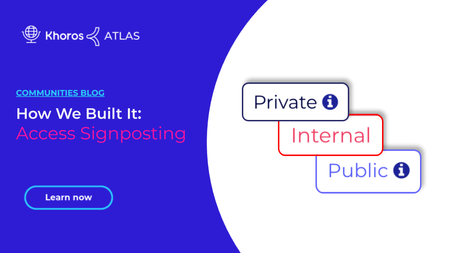
Atlas users have asked us how we built our customization that displays a fixed indicator (we call it a signpost) highlighting the access level of content on the current page being viewed. You can easily incorporate this customization into your community using the examples and source code in this article. Thanks to Claudius and AndyK for writing and sharing this customization! About the customization Make this your own Customization source code We built a custom component with FreeMarker that determines the right signpost to use based on the node in context. We use CSS to change the styling, text, and hover text based on the access level. About the customization The component logic First, we mapped out which nodes match which access levels we want to highlight (Public, Private, Internal, Registered, and Archive). We created a series of "if" statements using the OR comparison operator (||) to evaluate the node in context. If the page being viewed belongs to a node that matches the condition of the comparison logic, then we display the related access signpost. In some cases, we evaluate based on the current node's ancestors (container nodes in the Community Structure like a category or group hub). In other cases, we evaluate by node ID. For example, we want the Events category and all of its child nodes to be Public. In the snippet below, the comparison using coreNode.hasAncestor handles the case where the node in context is a child node within the Events category. The comparison using coreNode.id handles the case when the current node in context is the Events category Category Page: coreNode.hasAncestor("events") == true || coreNode.id == "events" Let's go a step further. This next snippet shows the logic we use to evaluate whether a node meets the "Public" access level criteria. This logic displays our signpost on the Events Category Page, all subpages in the Events category, and our Contact Support board. We create and style the signpost using the public-logo-link class. Note: We simplified the code in this snippet. See the full component source code at the end of this article. <#assign public = "" /> <#-- Define the Public criteria: The node being viewed must be the "events" node, a child node within the "events" node, or the "contact-support" node. --> <#if coreNode.id == "events" || coreNode.hasAncestor("events") == true || coreNode.id == "contact-support"> <#-- If the node in context meets the Public criteria, display the Public indicator with a Help icon that reveals a tooltip describing the access level on hover over. --> <span class="public-logo-link" title="Visible to the public including non-registered users.">Public <span class="lia-img-icon-help lia-fa-icon lia-fa-help lia-fa" aria-label="Help Icon" role="img" id="display"></span></span> Learn more about FreeMarker with Khoros C…3.4KViewsSign in to react to this post15CommentsHow We Built It: Author Stamps
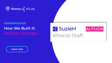
As part of our ongoing series featuring customizations and solutions we’ve created for Khoros Atlas, this guide is going to give you a step-by-step breakdown of how you can add a colorful author stamp to comments and replies made by the original author of a blog post or message. In the above image, you’ll see a magenta stamp with the word AUTHOR in it. This stamp only appears for the original author of a blog post or message within their replies or comments. Creating this stamp is pretty simple. It involves the creation of a component, the addition of some custom styling, and the component’s placement on two item types. Step 1: Create the component The author-badge component needs to be created so we can place it in the appropriate places using the Quilt. Here’s the process: Navigate to Studio > Components within the Community Admin. Select New Component. Assign the new component the name author-badge . Drop in the following code snippet. <#if (env.context.message.author.id)?? && (env.context.message.parent)?? && (page.context.thread.topicMessage.author.id)??> <#assign userId = env.context.message.author.id /> <#assign topicMessageId = page.context.thread.topicMessage.author.id/> <#if (userId)?? && (topicMessageId)?? > <#if (topicMessageId)?? && userId == topicMessageId> <div class="author.badge"> <span class="badge1" data-badge="AUTHOR"></span> </div> </#if> </#if> </#if> Select Save to create the new component. The snippet performs several important tasks. First, it captures the ID of the author and message. If the author ID matches the ID of the author of the message, the component displays a stamp with the word AUTHOR . That badge’s styling is provided by the author.badge and badge1 classes. Step 2: Add custom styling to the skin The next step involves locating the skin your site is currently using, and editing the _styles.scss file to include new styling for the stamp. Here is how you can accomplish this: Navigate to Admin > Display > Skins within Community Admin. Take note of the skin currently being used. This skin has a filled-in radial field next to it on the list. Navigate to Studio > Community Style. Locate the current, active skin in the sidebar and select it. Select the CSS tab. Under sass in the file tree, choose the _style.scss file. Add the below snippet to the stylesheet. .badge1 { position:relative; padding-left:2vh; } .badge1[data-badge]:after { content:attr(data-badge); top:2px; right:3px; font-size:.8em; background:#E21A9A; color:white; width:40%; height:15px; text-align:center; line-height:18px; …3.6KViewsSign in to react to this post14CommentsHow We Built the KB Audit Flow Part 2: Audit Checkbox (Updated)
The KB Audit Flow requires two components to work. The first is an audit checkbox that enables members with specific roles to mark a KB article as "audited" from the front end. This checkbox includes the initial check and confirmation. The second component is the 'Last Reviewed' Information component which displays the date and time of the last audit of the KB article. That component is displayed for all visitors, regardless of their role(s). It does, however, check the member's roles to determine whether or not to additionally display the audit checkbox featured in this post. In this post, we will create a new audit checkbox component. Note: These instructions cover the method for creating the component using the Community Plugin SDK. For an easier UI-based approach, we recommend using Studio to create the component. The content of the file below remains the same. We highly recommend reading the other two posts in this series to get a better understanding of the other components and prerequisites required for this component to function properly. How We Built the KB Audit Flow Pt. 1 How We Built the KB Audit Flow Pt. 3: Review Date Display Create a Custom Endpoint A custom endpoint enables the audit checkbox component to send the "last reviewed" timestamp to Khoros, updating the date and time the article was last audited. To create this custom endpoint: Navigate to Studio > Endpoints Select the New Endpoint button Enter last-reviewed-date in the title field Select Save Enter the following in the View Content field: <#assign msg_id = http.request.parameters.name.get("msg_id", "")?string /> <#assign date_time = http.request.parameters.name.get("date_time", "")?string /> <#if msg_id != ""> <#assign lastReviewedDateResponse = restadmin("/messages/id/${msg_id}/metadata/key/custom.message_last_reviewed_date/set?value=${date_time}") /> </#if> Select Save This creates a new custom endpoint which passes the message identifier and datetime to Khoros. It is utilized by the Audit checkbox component we are creating next. Create LastReviewed-Audited-checkbox.ftl file The process for creating the checkbox component is pretty straightforward. To start, create the LastReviewed-Audited-checkbox.ftl file as a component. For example: /res/components/LastReviewed-Audited-checkbox.ftl. Here are the contents of that file: <style> .audited-component-checkbox{ margin-top: -20px; margin-bottom: 35px; } label.lia-form-label.audited-label-set { padding-top: 4px; font-weight: bold !important; float:left; } .litho-audited-checkbox-style{ float: left; } .lia-form-label-wrapper.audited-label-float{ float: left; } .lia-inline-confirm.confirm-label-float{ float: right; margin-top: 4px; margin-left: 12px; } a.litho-tkb-audited-deny { cursor: pointer; } a.litho-tkb-audited-approve…627ViewsSign in to react to this post0Comments