How We Built It: Since you were gone component
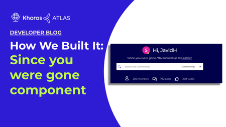
Overview This article explains how to build a custom component and attach it to the community hero element on your community home page. You can add this custom component to any element based on your preference. This custom component fetches recent notifications when the user is not signed in to the community. These recent notifications are rendered on your community home page based on whether the user is anonymous or registered. The purpose of this component is to notify visitors about recent activities performed on the user account for registered users and for anonymous users, a custom text based on your preference will be displayed. Building the Since you were gone component is done in three steps: Creating a custom component walkthrough Assigning the custom elements with custom text Adding the custom component to your community homepage Here is an image of the Since you were gone component in Atlas Community: Creating a custom component walkthrough Create a new custom component in Studio named since_you_were_gone (Studio > Component > New component). To add the below custom component code snippet, you must have community admin permission. <#if user.anonymous> <div class="hero-desc hero-desc-space-style"> <span>${text.format("custom.hero-desc.anonymous")}</span> <a href='${webUi.getUserRegistrationPageUrl("/")}'>${text.format("custom.hero-desc.anonymous.joinus")}</a> </div> <#else> <#assign notifications = rest("/users/self/notifications/unread/count").value?number/> <#assign notificationfeedCount = liql("SELECT count(*) FROM notification_feeds" )/> <#assign num=notificationfeedCount.data.count?number/> <#if (num> 0) && (notifications>0) > <div class="hero-desc hero-desc-space-style"> <div class="since">${text.format("custom.hero-desc.loggedin")}</div> <#attempt> <@component id="notificationfeed.notificationList" lazyLoad="true" /> <#recover> </#attempt> </div> <#else> <div class="hero-desc hero-desc-space-style"> <div class="hero-desc hero-desc-space-style">${text.format("custom.hero-desc.no.recent.notification")}</div> </div> </#if> </#if> We are going to break down the code into six sections. Section 1 (Line 1-6) <#if user.anonymous> <div class="hero-desc hero-desc-space-style"> <span>${text.format("custom.hero-desc.anonymous")}</span> <a href='${webUi.getUserRegistrationPageUrl("/")}'>${text.format("custom.hero-desc.anonymous.joinus")}</a> </div> <#else> If user.anonymous is true, then proceed. The remainder of the component code is contained in this if statement. If user.anonymous is not true, the component is not rendered on the page and moves to line 7 which is for registered user. The text of the following elements appears on the homepage. custom.hero-desc.anonymous custom.hero-desc.anonymous.joinus Section 2 (Line 7) <#assign notifications = rest("/users/self/notifications/unread/count").value?number/> From this line, the below-described codes are for the registered community user. We create a variable named notifications. This will hold the count of the unread notifications. To set the value, we use the rest FreeMarker method to call the Community API v1 /users/self/notifications/unread/count endpoint. This query retrieves the count of notifications for self as a number. Section 3 (Line8) <#assign notificationfeedCount = liql("SELECT count(*) FROM notification_feeds" )/> We assign our LiQL query to a variable called notificationfeedCount. This is the query: SELECT count(*) FROM notification_feeds This query retrieves the count from the notification feeds of the user as a string. Section 4(Line 9) <#assign num=notificationfeedCount.data.count?number/> We create a variable named num. This variable fetches the count of the notification feed which is a string that converts it to a number using the ?number function. Section 5(Line 10) <#if (num> 0) && (notifications>0) > <div class="hero-desc hero-desc-space-style"> We use the && - AND operator to combine the results of lines 7 and 9. If there is a value-based out of the && - AND operation, then the remainder of the component code is contained in this if statement. Section 6 (Line 11-22) <div class="since">${text.format("custom.hero-desc.loggedin")}</div> <#attempt> <@component id="notificationfeed.notificationList" lazyLoad="true" /> <#recover> </#attempt> </div> <#else> <div class="hero-desc hero-desc-space-style"> <div class="hero-desc hero-desc-space-style">${text.format("custom.hero-desc.no.recent.notification")}</div> </div> </#if> </#if> In these lines, we declare the custom.hero-desc.loggedin element. In line 13, we use the core component notificationfeed.notificationList to retrieve the latest article activity of the user. We also set the lazyLoad=true, so that it does not increase the initial page load time. Line 13 is the only core component and other parts of the code are custom based on your preference. Furthermore, we also declare the custom.hero-desc.no.recent.notification element so that if there is no recent notification, this element displays the No new recent activity text on your community home page. With lines 21 and 22, we close the if statements Assigning the custom elements with custom text In the above section, we have added some custom elements. In this section, we are going to assign those custom elements with text. Go to Studio > Text Editor > Community Text. Click Search. You can see the text properties. Assign the following custom elements to the text. custom.hero-desc.anonymous = To connect with the brightest leaders and practitioners of Digital Customer Engagement, custom.hero-desc.anonymous.joinus = join your community custom.hero.desc.loggedin = Since you were gone, custom.hero-desc.no.recent.notification = No new activity found Click Save. The above elements will be rendered based on the user and will display on the community home page. Adding the custom component to the community homepage In this section, we are going to add the since_you_were_gone component to your community element based on your preference which will appear on your community homepage in the Studio. Go to Studio and select the layout on which you want to add this component. We are adding it to the Community Hero Layout and click Save. Conclusion There you have it! The Since you were gone component appears on your community home page, customized for each visitor. Here is the image of the Since you were gone component for an anonymous user. Here is the image of the Since you were gone component for a community member(registered user). 1.8KViewsSign in to react to this post
 7Comments
How We Built It: User Profile Hover Card
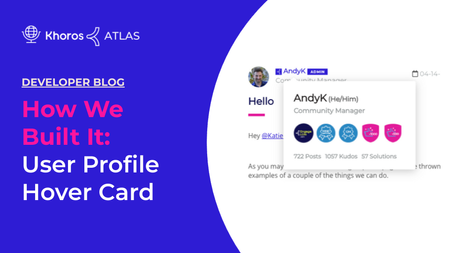
Overview User Profile Hover Card is used to display user information such as pronouns, roles, number of posts, kudos, and solutions. With the User Profile Hover Card, you see user information while viewing any article in your community by hovering your mouse cursor over either their avatar or the user name. Note: The User Profile Hover Card will not be displayed in the user profile. A JavaScript function will be attached to certain elements on the page that makes an AJAX call to the server when the mousenter event is triggered. This AJAX call request will return all the information necessary to display a hovercard with the user profile information. You can create a Profile Hover Card using these three steps covered in this guide. Building an endpoint Creating a custom javascript function Adding a javascript function to a quilt to display the user information Here is an image of the User Profile Hover Card in Atlas Community: Building the endpoint Create a new endpoint in Studio named profile-card (Studio > Endpoints > New Endpoint). Here is the overall structure of our code. After some initialization code and setting up some variables, we have two main steps outlined in the comments. <#compress> <#-- Set up number format and import some functions you will use later on --> <#setting number_format="0.######"/> <#include "theme-lib.common-functions" /> <#-- The user whose profile information we would like to display --> <#assign userId = getRequestField("userId", "-1", true)?number /> <#assign unqId = getRequestField("unqId", "")?string /> <#assign badgeSize = 5 /> <#if userId gt 0 && validEndpointRequest(false, true,false)> <#-- Step 1. Make REST call for the data required for the component --> <#-- . . . see below code snippet . . . --> <#-- Step 2. Render the actual card markup --> <#-- . . . see below code snippet . . . --> </#if> </#compress> Step 1 To fetch the user’s profile information, we just need to write a LiQL request and make the request assigned to a variable. <#assign userQry = "SELECT login, view_href, rank.name, rank.color, user_badges FROM users WHERE id='${userId}'" /> <#assign userProfileData = executeLiQLQuery(userQry) /> Step 2 In step 2, we will use the data we just fetched to create some variables and return the markup required for the hovercard. <#if userProfileData?size gt 0> <#assign userProfileData = userProfileData[0] /> <div> <section> <span><span id="cardTitle-${unqId}"><a href="${userProfileData.view_href}">${(userProfileData.login)!""}</a></span> <span id="cardDesc-${unqId}">${(userProfileData.rank.name)!""}</span> </section> <#-- display badges --> <#if userProfileData.user_badges?? && userProfileData.user_badges.size gt 0> <section> <#assign badgeCount = 0 /> <#list userProfileData.user_badges.items as userBadge> <#if userBadge.earned_date??> <div> <img title="${userBadge.badge.title}" alt="${userBadge.badge.title}" src="${userBadge.badge.icon_url}"> </div> <#assign badgeCount = badgeCount + 1 /> <#if badgeCount == badgeSize> <#break> </#if> </#if> </#list> </section> </#if> <#-- posts, kudos, solutions --> <#assign postCount = 0 /> <#assign kudoCount = 0 /> <#assign solutionCount = 0 /> <#assign metricsQry = "SELECT * FROM metrics WHERE user.id = '${userId}' AND id IN ('net_overall_posts','net_accepted_solutions','kudos_weight_given','kudos_weight_received')" /> <#assign metrics = executeLiQLQuery(metricsQry, false, true) /> <#if metrics?size gt 0> <#list metrics as metric> <#switch metric.id> <#case "net_overall_posts"> <#assign postCount = metric.value?number /> <#break /> <#case "net_accepted_solutions"> <#assign solutionCount = metric.value?number /> <#break /> <#case "kudos_weight_received"> <#assign kudoCount = metric.value?number /> <#break /> </#switch> </#list> </#if> <section> <ul> <li>${postCount} <span><#if postCount == 1>${text.format("general.Post")} <#else>${text.format("general.Posts")}</#if></span></li> <li>${kudoCount} <span><#if kudoCount == 1>${text.format("general.Kudo")} <#else>${text.format("general.Kudos")}</#if></span></li> <li>${solutionCount} <span><#if solutionCount == 1>${text.format("general.solution")} <#else>${text.format("general.Solutions")}</#if></span></li> </ul> </section> </div> </#if> </#if> It looks like a lot of code, but it’s pretty straightforward once you get the hang of it. Now that we’ve got a backend endpoint that can talk to the Community's backend and render markup, we will turn our attention to the client so we can make use of it. Create a custom javascript function In Studio > Components > New Component, create a component named custom.profile-card.script. This is where we will attach an event to elements on the page to trigger the hovercard which we wrote in the Building the endpoint section. We will be using @liaAddScript to insert our jQuery, but first, we need to set up the component by adding some common functions and preventing this script from running if we are on the user profile page. <#include "theme-lib.common-functions" /> <#if page.name != 'ViewProfilePage'> <@liaAddScript> <#-- This is where the main javascript will go --> </@liaAddScript> </#if> Now we can focus on what goes in between our @liaAddScript tags. We’ll start with an Immediately Invoked Function Expression (IIFE), like any other custom script. Here we’ve got two things to accomplish: first, we need to define a helper function to generate a unique id for the hovercard so we can keep track of it in the backend. Second, we’ll attach mouse events to certain elements of the page to make our AJAX calls. Note: You will see references to CSS classes that handle animation for the appearance and dismissal of the card. This tutorial does not include styling, but the classes should be named in such a way that you can add animations to them or simply show or hide the element. ;(function($) { <#-- Make Unique Id makeid() : string () --> function makeid() { var text = ""; var possible = "ABCDEFGHIJKLMNOPQRSTUVWXYZabcdefghijklmnopqrstuvwxyz0123456789"; for (var i = 0; i < 5; i++) text += possible.charAt(Math.floor(Math.random() * possible.length)); return text; } $(document).ready(function () { $('body').on({ mouseenter: function(evt) { <#-- break out early and don't render the card --> if ($(this).parents('.lia-component-users-widget-menu').length > 0) { return; } if ($(this).hasClass("disable-hovercard"){ return; } evt.preventDefault(); evt.stopPropagation(); $('.hc-user-profile').removeClass('hc-animate-in hc-is-shown'); <#-- if the card already exists for this avatar/link, just reshow it (no need to go fetch another one) --> if ($('.hc-user-profile', this).length > 0) { $('.hc-user-profile', this).addClass('hc-animate-in hc-is-shown'); return; } var unqId = makeid(); var userId = $(this).attr('href').substring($(this).attr('href').lastIndexOf("/")+1, $(this).attr('href').length); <#-- prepare a container for the card we will render --> var divContainer = $('<div class="hc-user-profile user-profile-card" role="dialog" aria-labelledby="cardTitle-'+unqId+'" aria-describedby="cardDesc-'+unqId+'"><div class="hc-main-container info-container"><div class="spinner"></div></div></div>'); $(this).append(divContainer); $(divContainer).addClass('hc-animate-in hc-is-shown'); <#-- request to the endpoint we created earlier --> <#-- passing back to the userid for our backend LiQL call --> $.ajax({ url: '${getEndpointUrl("profile-card")}', type: 'post', dataType: 'html', data: {"userId": userId, "unqId": unqId}, beforeSend: function() {}, success: function(data) { $('.info-container', divContainer).append(data); }, error: function() { console.log('your error message should go here.'); $('.info-container', divContainer).append('<div class=""><i class="lia-fa fa-var-close" /></div>'); }, complete: function() { $('.spinner', divContainer).remove(); } }); }, mouseleave: function() { $('.hc-user-profile').removeClass('hc-animate-in hc-is-shown'); } }, 'a.lia-link-navigation.lia-page-link.lia-user-name-link,.UserAvatar.lia-link-navigation'); })(LITHIUM.jQuery); You can see at the end, that we attach the jQuery function to .lia-user-name-link and .UserAvatar.lia-link-navigation. These are the elements that will be hoverable. Adding the custom javascript function to the quilt Finally, we will attach the custom script we just wrote to a quilt that is always present on the page: Footer.quilt.xml <add to="ui-scripts"> <component id="custom.profile-card.script"/> </add> Conclusion There you have it! A hover action that, when triggered, will make a request to the backend, fetch information about the user in question, and render a user profile hovercard to get quick information about that user.728ViewsSign in to react to this post0CommentsHow We Built It: Pronouns in User Profiles
A while back, Atlas added the ability for users to add personal pronouns to their user profile. You can read about this enhancement in Atlas Proudly Adds Pronouns Option to Profile. Today, we take a technical dive into how we added a Pronouns field on the Atlas user profile and registration page using a custom field setting and a custom component. Note: Customizations in your community might conflict with the implementation that we describe in this article. For example, if your community has removed the "Personal Information" tab in My Settings > Personal, you will not be able to add the pronouns to the Personal Information tab exactly as described here. Pronoun field on the User Registration page Pronoun field in the Personal Information tab Customization overview Create your Support ticket Create a redirect component Update attribute mappings in Community Admin (SSO-only) Use pronouns in customizations Pronoun field on the User Registration page Here is how the Pronoun field appears on the User Registration page. Pronoun field in the Personal Information tab Here is how the Pronoun field appears on the Personal Information tab under My Settings > Personal. We created a custom component to add an Update who can see your private info link under the field that redirects the user to the My Settings > Preferences > Privacy page to modify their pronoun privacy preference. We show the code for this link in Create a redirect component. Note: If your community had the Personal Information section removed from My Settings > Personal, you will need to consider asking Support to restore the Personal Information tab with just the Pronoun field or implement some other method for users to edit their personal pronouns through the community user interface. Customization overview Let's take a quick look at the customization as it was implemented on Atlas. You'll need Khoros Support to perform some back-end tasks and you'll also need to build a simple custom component. Important: Our implementation uses a non-SSO registration flow. If you're interested in trying this customization in an SSO community, be sure to read the next section for caveats and considerations. Developer/Community Manager tasks: Create a custom component that creates a redirect link to the user's Privacy Settings page so that they can control who can see their personal pronouns. File a Support ticket requesting back-end configurations Khoros Support tasks: Create a custom field setting where users can enter and modify their personal pronouns. Add the new field to the required page forms. Once the custom field is in place, you'll be able to access it via the Community REST API in FreeMarker customizations. NOTE TO KHOROS SUPPORT STAFF: See Add a custom pronoun field setting to the user profile for instructions relating to these enablement and configuration tasks. SSO considerations This section applies only to customers using SSO. If you are using Khoros Community's out-of-the-box Authentication feature you can ignore this section. If your company already stores pronoun data (outside of Community) and wants to pass the pronoun data through SSO, the implementation differs depending on which method of SSO you use. Methods that require a Services engagement will need to be scoped for cost. SSO Method Who Implements it? Services Engagement? Khoros SSO (previously called Lithium SSO) The customer must add the data to the SSO token they generate. Reference the name of the setting configured for you by Khoros Support with the value to set. See About Khoros Single Sign-On (SSO) for more information. No Self-Service SAML Customer must update the attribute mapping in Community Admin. See Self-serve SAML SSO set up in the Admin Panel. No Legacy SAML Khoros Support must update the attribute mapping configuration No Self-Service OAuth 2/Open ID Connect Customer can update the attribute mapping in Community Admin. See and About the OpenID Connect Plugin. No Legacy Oauth 2 or Open ID Connect Khoros Professional Services Yes Custom SSO solution Khoros Professional Services Yes Create your Support ticket This customization requires a Support ticket to: create a custom user setting field that will hold the pronoun value. add the new field to user registration and user profile forms in the Community UI. In your Support ticket: request a custom user setting field that will hold the pronoun value. Request the new field be set as type "String" provide a name for the setting field. It should be lower-case with underscores if needed. Example: profile_name_pronoun include the name of the custom component used to redirect to the My Settings > Preferences > Privacy page. (We describe how to write this component in the next section). request for the new setting and redirect component to be added to the PersonalProfile form XML as a field setting. (SSO-only) include the method of SSO that your community uses (see options from the table above) (Non-SSO only) request for the new setting to be added to the UserRegistration and UserRegistrationDialog form XML as a setting field. Create a redirect component We created a custom component called custom.profile.name.prefix.make_public to provide a link to the My Settings > Preferences > Privacy page. The link enables the user to quickly modify their pronoun privacy preference if they desire. To replicate this, create a custom component to render the link. Include the component name in your Support ticket. Instead of adding the component to a page, Support will add a reference to the component when they add the new pronoun user setting to the Personal Profile form XML. This is the code for the link. You'll want to add your own styling for the component in your CSS and use a text key for the link text if your community uses multiple languages. <a href="/t5/user/myprofilepage/tab/user-preferences:privacy" target="_blank">Update who can see your private info</a> Update attribute mappings in Community Admin (SSO-only) If your community uses Khoros SSO, Self-Service SAML, or Self-Service OAuth 2/Open ID Connect update attribute mappings as directed in the guides referred to in the table above in SSO considerations. Use pronouns in customizations After Support has finished with your ticket (and you have updated attribute mappings required for an SSO implementation), you're ready to use pronouns in customizations. Request the pronoun metadata Display the pronouns Once users set their own pronouns, you can display them in custom components. You'll see on Atlas that we display pronouns in several places (given that the end-user has given permission for pronouns to be displayed). For example, you can see mine in my profile hovercard and in my member profile. Profile Hover Card Member Profile Request the pronoun metadata In your custom component, you'll need to make a request to the Community REST API v1 endpoint /users/id/[id]/settings/name/[setting_name]. The FreeMarker will look something like this <#assign namePronouns = rest("/users/id/${page.context.user.id}/settings/name/custom-setting-name").value /> Notice here that we are retrieving the user specific to the Profile Page context using the page.context.user.id FreeMarker context object and that we pass the name of the custom pronoun field. The .value returns the value of the field. We've assigned the pronoun value to the namePronouns variable. Display the pronouns Now that we've got the user's pronouns, we can display them using a FreeMarker interpolation. We reference this text key to render the field name: page.search.field.custom.profile_name_prefix = Pronouns <section> <span>${page.search.field.custom.profile_name_prefix}</span> <span>${namePronouns!""}</span> </section> If you wanted to display the user's name in addition to their pronouns, the code could look something like this. <#assign namePronouns = rest("/users/id/${page.context.user.id}/settings/name/custom-setting-name").value /> <#assign nameFirst = rest("/users/id/${page.context.user.id}/settings/name/profile.name_first").value /> <#assign nameLast = rest("/users/id/${page.context.user.id}/settings/name/profile.name_last").value /> <table> <tbody> <#if namePronouns?? && namePronouns?length gt 0> <tr> <td>${page.search.field.custom.profile_name_prefix}</td> <td>${namePronouns}</td> </tr> </#if> <#if nameFirst?? && nameFirst?length gt 0> <tr> <td>${custom.profile_name.title}</td> <td>${nameFirst!""} ${nameLast!""}</td> </tr> </#if> </tbody> </table> And there you have it! A custom profile field to store pronouns that can be added to any component in your Community.575ViewsSign in to react to this post0CommentsHow We Built It: Platform Status Banner
While we prefer the Khoros platform to be operational at all times, there are times when our product experiences a service disruption. When this happens, it is critical that we inform our customers. We do this by presenting a platform status banner in our Atlas Community. Here is an image example of the Khoros Platform Status Banner: We had some interest here to explain how we achieved this functionality. Let's get into the details! Since your systems will vary from ours, we have made the integration explanation more generic so that you can more easily adapt it to your needs. On its surface, this is a pretty simple feature. It is a custom component that conditionally shows markup based on a JSON response. That is what we will walk you through. Data Source Each product that we want to monitor has a data source that provides the operational status. For the Atlas status banner, Community, Care, Marketing, Flow, and CX Insights are all data sources. First, we need to connect to those data sources via an API. Like many SAAS companies, we use both internal and external monitoring services. You'll need to identify what monitoring services your company uses and find the API that returns the statuses you need. A sample response from a monitoring service could look like the following: [ { id: "SERVICE_ID" name: "SERVICE_NAME", platform: "PLATFORM_NAME" status: "operational", }, { id: "SERVICE_ID" name: "SERVICE_NAME", platform: "PLATFORM_NAME" status: "degraded_performance", }, { id: "SERVICE_ID" name: "SERVICE_NAME", platform: "PLATFORM_NAME" status: "major_outage", }, ... ] Now we need to interpret the above response and render our banner to your community page. Custom Component To display the operation status retrieved from the monitoring service, create a custom component in Community > Studio that displays the platform status banner with markup and Javascript (using the LiaAddScript FreeMarker directive). Markup In your new custom component, set up the markup you want to display in your community. Note that we have set display:none upon initial render. This hides the component until JavaScript logic (described later) determines if any products have a degraded service status to report. <div class="my-fancy-status-component-container" id="StatusComponent" style="display: none;"> <span class="status_container"> <span class="status-name">PLATFORM</span> <span class="status-separator">:</span> <span class="PLATFORM-indicator"></span> </span> <!-- ... repeat for other platforms --> </div> LiaAddScript In a <@liaAddScript>, make a request to fetch your data and modify your markup. <@liaAddScript> ;(function($) { $.ajax({ type: 'GET', url: 'http://example.com/your-status-endpoint', dataType: 'json', success: function(listOfPlatformStatuses) { listOfPlatformStatuses.forEach(platformStatus => { $(`.${platformStatus.platform}$-indicator`).toggleClass(`${platformStatus.status}`); $(`.${PLATFORM}-indicator`).after(platformStatus.status.split('_').join(' ')); $('#StatusComponent').show(); }); }); })(LITHIUM.jQuery); </@liaAddScript> This liaAddScript directive describes the GET endpoint to retrieve the status of the various products you want to monitor. The url represents the status page of the product. The success function tags the listOfPlatformStatuses. The listOfPlatformStatuses contain all the responses of the platform from the GET API call. The forEach function is a built-in function that helps us to trace the list elements one by one (i.e) the Platform status of your product. The toggleClass function toggles the CSS classes of the platform as per your custom styling. In the next line, we split the platform status based on ‘_’ and join with ‘ ‘. The $('#StatusComponent').show() displays the status of your product in the platform status banner. You will need to modify the above code to fit your specific use case. Final Step Add the customized component to the header of your community page and the platform status banner component is integrated into your community. Example If your platform status is degraded_performance, then based on split and join operation and the codes, we make it degraded performance. Then, the toggleClass operation is used to render the degraded performance based on your CSS styling. Finally, the degraded performance is displayed in the Platform Status banner component.636ViewsSign in to react to this post1CommentHow We Built It: Custom Community Banners
Custom community banners are a great way to enhance the user experience throughout your Community. In Atlas, we use custom content to draw attention to important features, direct users to useful pages, and share news from our team. In this post, we take a look at some of the ways you can leverage Khoros Communities' Custom Content features to enhance your user's experience. You can customize Custom Content with a little scripting in several ways: Show or hide the component based on the user's role(s) Add CSS styling unique to the component Display images hosted externally or through your Community's Asset Library Direct users to a specific link or area of your Community In this example exercise, we're adding the banner (below) to our community's pages. We will go through the process of uploading the image asset, creating the custom content, and adding the Custom Content component to our Community Page's quilt. Upload Image Assets to your Community We start with a simple PNG image that we want to display in the custom community banner. This image file needs to be hosted somewhere. This could be an external hosting arrangement, or directly hosted from within your community using the Community Asset Library. You can upload image assets to the Asset Library by doing the following: Go to Studio > Community Style Tab. Select Asset Library from the Work With drop-down menu. Click the Other Assets tab. Click the Choose File button and select the file you want to upload. Click Upload. After you have uploaded the new asset, you can locate the file in the list and discover its unique URL. Make note of this URL since you will need it when crafting the Custom Content in the next step. In our example, our file is located at /html/assets/thankyou2.png. Add Custom Content to the Quilt This last step is pretty straightforward. We need to add our new Custom Content to the quilt for the page(s) we want the banner to appear on. In our example, we're adding it to the Community Page. Here's how: Go to Studio > Page. Expand the Custom Content area of the Components list. Select the Custom Content item you want to use for this banner by clicking the plus (+) symbol next to it as you hover over it with the cursor. Drag the Custom Content component to the area of the quilt in which you want the banner to display. Scroll down to the bottom of the page and click Save. Once you have configured the custom content, your new custom community banner should appear where you configured it to go and for the users with the role(s) you specify in the content's scripting. Create Custom Content Now that you have the image asset(s) you want to display in the custom community banner uploaded, you can create the custom content that the image(s) will be displayed through. Here's how: Go to Community Admin > Content > Custom Content. Select a Custom Content Setting that you want to use. Ideally, this would be one that doesn't already have content in it, matching the item that you selected in the previous step. In our case, this is Custom Content 2. Add your unique content to the Text field. See our example in the Custom Content Example section below. Click Save. Note: The name of the Custom Content Setting. It should match the one you placed in the quilt in the Add Custom Content to the Quilt section, above. Custom Content Example In our example, we are creating a custom community banner that only appears for users with specific roles and that has styling that matches our needs. Here is the content we used in the Text field: <style> .image-responsive-style { width: auto; margin-top: 40px; margin-left: -12px; cursor: pointer; } @media only screen and (min-width: 1024px) { .desktop-margin-image { margin-top: -40px; } } </style> <#assign user_has_role=false /> <#if !user.anonymous> <#list restadmin("/users/id/${user.id?c}/roles").roles.role as role> <#if role.name?? && ((role.name=="Administrator" )||(role.name=="Example" ))> <#assign user_has_role=true /> </#if> </#list> </#if> <#if user_has_role> <center style="margin-bottom: -25px;" class="desktop-margin-image"> <a href="/t5/forums/searchpage/tab/message?filter=labels&q=%22example%22&noSynonym=false&advanced=true&collapse_discussion=true&search_type=thread&labels=example "> <picture> <source media="(min-width: 1024px)" srcset="/html/assets/thankyou2.png"> <img src="/html/assets/thankyou2.png" class="image-responsive-style"> </picture> </a> </center> </#if> To understand how this works, let's break down this custom content piece-by-piece. <style> ... </style> Everything within the <style></style> tags is there to add additional CSS styling to the custom content component itself. This is a great way to add a little extra visual flare to your banner, or to ensure that it sits exactly where you need it to on the page. <#assign user_has_role=false /> This if statement uses the restadmin context object to make an API call that checks the user's roles to see if they have either the Administrator or Example role applied to their profile. If they do, then the user_has_role variable is set to true. Otherwise, no changes are made and the value remains false. <#if user_has_role> <center style="margin-bottom: -25px;" class="desktop-margin-image"> <a href="/t5/forums/searchpage/tab/message?filter=labels&q=%22example%22&noSynonym=false&advanced=true&collapse_discussion=true&search_type=thread&labels=example "> <picture> <source media="(min-width: 1024px)" srcset="/html/assets/thankyou2.png"> <img src="/html/assets/thankyou2.png" class="image-responsive-style"> </picture> </a> </center> </#if> Finally, we have an if statement that displays the banner image (along with other HTML properties such as its HREF link) if the user_has_role variable is true. In our example, we're directing users that click the banner to a search page within the Community. The image source location is the relative URL that we noted earlier upon uploading the asset to the Asset Library. Summary That's it! Your banner should now appear wherever a user with the right role(s) visits the page(s) you have configured the banner for. This technique isn't just useful for simple image banners. It can be used for virtually any user experience customization you need, from visual fair between components to important announcements you want to make to your visitors. You can use Freemarker to supercharge this content and leverage information about your community to create a more dynamic experience for your audience.999ViewsSign in to react to this post1CommentHow We Built the TKB Audit Flow Part 3: Review Date Display
The Review Date Display component is the meat and potatoes of our KB Audit Flow solution on the front end. It's the component that visitors see, displaying the date the article was last reviewed by the team. It also checks the user's roles to determine if they have the specified role(s) to access the Audit checkbox which updates the last reviewed date. In this part of the KB Audit Flow series, we're going to create the Review Date Display Info component. We highly recommend reading the first two posts in this series to get a better understanding of the other components and prerequisites required for this component to function properly. How We Built the KB Audit Flow Pt. 1 How We Built the KB Audit Flow Pt. 2: Audit Checkbox Create the LastReviewedInfoTaplet.ftl file To get started, create a new file: /res/components/LastReviewedInfoTaplet.ftl. Note: These instructions cover the method for creating the component using the Community Plugin SDK. For an easier UI-based approach, we recommend using Studio to create the component. The content of the file below remains the same. Here are the contents of the new file: <style> .audited-component-checkbox{ margin-top: -20px; margin-bottom: 35px; } label.lia-form-label.audited-label-set { padding-top: 4px; font-weight: bold !important; float:left; } .litho-audited-checkbox-style{ float: left; } .lia-form-label-wrapper.audited-label-float{ float: left; } .lia-inline-confirm.confirm-label-float{ float: right; margin-top: 4px; margin-left: 12px; } a.litho-tkb-audited-deny { cursor: pointer; } a.litho-tkb-audited-approve { cursor: pointer; } .hide-article-component-here{ display:none; } </style> <#-- <#import "article" as com> --> <div class="hide-article-component-here"> <@component id="article"/> </div> <#assign message_uniqueId = -1 /> <#if env.context.message??> <#assign message_uniqueId = env.context.message.uniqueId /> <#assign lengthOfDomain = env.context.message.webUi.url?index_of("/t5") /> <#assign communityDomain = env.context.message.webUi.url?substring(0,lengthOfDomain) /> </#if> <#-- ${message_uniqueId} --> <#-- <div class="reload-lastReviewedComponent"> <@component id="LastReviewedInfoTaplet" /> </div> --> <#-- REST call to get the user's roles --> <#list restadmin("/users/id/${user.id?c}/roles").roles.role as role> <#-- Look for the role name you want to display content for --> <#if role.name?? && ( (role.name == "Administrator") || (role.name == "Documentation") )> <div class="audited-component-checkbox"> <div class="lia-quilt-row lia-quilt-row-standard lia-quilt-row-first lia-quilt-row-last"> <div class="lia-quilt-column lia-quilt-column-24 lia-quilt-column-single lia-input-edit-form-column"> <div class="lia-quilt-column-alley lia-quilt-column-alley-single"> <div class="lia-form-row lia-form-auto-subscribe-to-thread-entry lia-form-row-reverse-label-input lia-form-row-checkbox litho-audited-checkbox-content"> <div class="lia-quilt-row lia-quilt-row-standard litho-audited-checkbox-style"> <div class="lia-quilt-column lia-quilt-column-24 lia-quilt-column-single"> <div class="lia-quilt-column-alley lia-quilt-column-alley-single"> <div class="lia-form-label-wrapper"> <input class="lia-form-auto-subscribe-to-thread-input audited-checkbox" id="LastReviewAudited" name="auditedCheckbox" type="checkbox"> </input> </div> </div> </div> </div> <div class="lia-form-label-wrapper audited-label-float"> <label for="LastReviewAudited" class="lia-form-label audited-label-set"> Audited </label> </div> <div class="lia-inline-confirm confirm-label-float confirm-label" style="display:none;"> Confirm? <a type="submit" class="litho-tkb-audited-approve"> Yes </a> / <a type="submit" class="litho-tkb-audited-deny"> No </a> </div> </div> </div> </div> </div> </div> <#break> </#if> </#list> <@liaAddScript> ;(function($){ $(".audited-checkbox").click(function(){ $('.confirm-label').toggle(); }); $(".litho-tkb-audited-approve").click(function(){ $(".audited-checkbox").attr("disabled", true); <#if message_uniqueId != -1 > <#assign session_key = restadmin("/authentication/sessions/login?user.login=LOGIN&user.password=PASSWORD").value /> var currentDateTime = new Date(); var dateTime = currentDateTime.toISOString(); $.ajax({ type:"POST", url:"${communityDomain}/restapi/vc/messages/id/${message_uniqueId}/metadata/key/custom.message_last_reviewed_date/set?value="+dateTime+"&restapi.session_key=${session_key}", contentType: 'application/json', success: function(res) { console.log(res); console.log("Added"); location.reload(true); }.bind(this), error: function(xhr, status, err) { console.error(xhr, status, err.toString()); console.log("unable to add last_reviewed_date field into DB"); }.bind(this) }); </#if> $(".audited-checkbox").prop("checked", false); $('.confirm-label').hide(); }); $(".litho-tkb-audited-deny").click(function(){ $(".audited-checkbox").prop("checked", false); $('.confirm-label').hide(); }); })(LITHIUM.jQuery); </@liaAddScript> This example should contain everything you need to get started, but note the USERNAME and PASSWORD in our example needs to be replaced. Code breakdown In this section, we will examine some of the parts of the component's code to better understand how the component works. <style> ... </style> Everything within the <style> tags sets the unique CSS styling that applies to elements within the component. <div class="hide-article-component-here"> <@component id="article"/> </div> This section imports the article into the component so we can retrieve its unique identifier. <#assign message_uniqueId = -1 /> <#if env.context.message??> <#assign message_uniqueId = env.context.message.uniqueId /> <#assign lengthOfDomain = env.context.message.webUi.url?index_of("/t5") /> <#assign communityDomain = env.context.message.webUi.url?substring(0,lengthOfDomain) /> </#if> This section includes an if statement that checks for the existence of a valid message and entering data for the Last Reviewed Date and Audited checkbox response. This includes retrieving the message's unique identifier and domain. <#-- REST call to get the user's roles --> <#list restadmin("/users/id/${user.id?c}/roles").roles.role as role> <#-- Look for the role name you want to display content for --> <#if role.name?? && ( (role.name == "Administrator") || (role.name == "Documentation") )> <div class="audited-component-checkbox"> <div class="lia-quilt-row lia-quilt-row-standard lia-quilt-row-first lia-quilt-row-last"> <div class="lia-quilt-column lia-quilt-column-24 lia-quilt-column-single lia-input-edit-form-column"> <div class="lia-quilt-column-alley lia-quilt-column-alley-single"> <div class="lia-form-row lia-form-auto-subscribe-to-thread-entry lia-form-row-reverse-label-input lia-form-row-checkbox litho-audited-checkbox-content"> <div class="lia-quilt-row lia-quilt-row-standard litho-audited-checkbox-style"> <div class="lia-quilt-column lia-quilt-column-24 lia-quilt-column-single"> <div class="lia-quilt-column-alley lia-quilt-column-alley-single"> <div class="lia-form-label-wrapper"> <input class="lia-form-auto-subscribe-to-thread-input audited-checkbox" id="LastReviewAudited" name="auditedCheckbox" type="checkbox"> </input> </div> </div> </div> </div> <div class="lia-form-label-wrapper audited-label-float"> <label for="LastReviewAudited" class="lia-form-label audited-label-set"> Audited </label> </div> <div class="lia-inline-confirm confirm-label-float confirm-label" style="display:none;"> Confirm? <a type="submit" class="litho-tkb-audited-approve"> Yes </a> / <a type="submit" class="litho-tkb-audited-deny"> No </a> </div> </div> </div> </div> </div> </div> <#break> </#if> </#list> This section checks for the user's assigned role(s) and compares them against a list of specified roles. If the user's role matches the role(s) specified, the "Audited" checkbox component is also displayed. In our example, we specified two roles: Administrator and Documentation. <@liaAddScript> ... </@liaAddScript> liaAddScript enables the use of Community's JQuery libraries used to access core features. You can find more information about liaAddScript in our developer documentation.577ViewsSign in to react to this post1CommentHow We Built the KB Audit Flow Part 2: Audit Checkbox (Updated)
The KB Audit Flow requires two components to work. The first is an audit checkbox that enables members with specific roles to mark a KB article as "audited" from the front end. This checkbox includes the initial check and confirmation. The second component is the 'Last Reviewed' Information component which displays the date and time of the last audit of the KB article. That component is displayed for all visitors, regardless of their role(s). It does, however, check the member's roles to determine whether or not to additionally display the audit checkbox featured in this post. In this post, we will create a new audit checkbox component. Note: These instructions cover the method for creating the component using the Community Plugin SDK. For an easier UI-based approach, we recommend using Studio to create the component. The content of the file below remains the same. We highly recommend reading the other two posts in this series to get a better understanding of the other components and prerequisites required for this component to function properly. How We Built the KB Audit Flow Pt. 1 How We Built the KB Audit Flow Pt. 3: Review Date Display Create a Custom Endpoint A custom endpoint enables the audit checkbox component to send the "last reviewed" timestamp to Khoros, updating the date and time the article was last audited. To create this custom endpoint: Navigate to Studio > Endpoints Select the New Endpoint button Enter last-reviewed-date in the title field Select Save Enter the following in the View Content field: <#assign msg_id = http.request.parameters.name.get("msg_id", "")?string /> <#assign date_time = http.request.parameters.name.get("date_time", "")?string /> <#if msg_id != ""> <#assign lastReviewedDateResponse = restadmin("/messages/id/${msg_id}/metadata/key/custom.message_last_reviewed_date/set?value=${date_time}") /> </#if> Select Save This creates a new custom endpoint which passes the message identifier and datetime to Khoros. It is utilized by the Audit checkbox component we are creating next. Create LastReviewed-Audited-checkbox.ftl file The process for creating the checkbox component is pretty straightforward. To start, create the LastReviewed-Audited-checkbox.ftl file as a component. For example: /res/components/LastReviewed-Audited-checkbox.ftl. Here are the contents of that file: <style> .audited-component-checkbox{ margin-top: -20px; margin-bottom: 35px; } label.lia-form-label.audited-label-set { padding-top: 4px; font-weight: bold !important; float:left; } .litho-audited-checkbox-style{ float: left; } .lia-form-label-wrapper.audited-label-float{ float: left; } .lia-inline-confirm.confirm-label-float{ float: right; margin-top: 4px; margin-left: 12px; } a.litho-tkb-audited-deny { cursor: pointer; } a.litho-tkb-audited-approve { cursor: pointer; } .hide-article-component-here{ display:none; } </style> <#-- <#import "article" as com> --> <div class="hide-article-component-here"> <@component id="article"/> </div> <#assign message_uniqueId = -1 /> <#if env.context.message??> <#assign message_uniqueId = env.context.message.uniqueId /> <#assign lengthOfDomain = env.context.message.webUi.url?index_of("/t5") /> <#assign communityDomain = env.context.message.webUi.url?substring(0,lengthOfDomain) /> </#if> <#assign communityId = community.id /> <#-- REST call to get the user's roles --> <#list restadmin("/users/id/${user.id?c}/roles").roles.role as role> <#-- Look for the role name you want to display content for --> <#if role.name?? && ( (role.name == "Administrator") || (role.name == "Documentation") )> <div class="audited-component-checkbox"> <div class="lia-quilt-row lia-quilt-row-standard lia-quilt-row-first lia-quilt-row-last"> <div class="lia-quilt-column lia-quilt-column-24 lia-quilt-column-single lia-input-edit-form-column"> <div class="lia-quilt-column-alley lia-quilt-column-alley-single"> <div class="lia-form-row lia-form-auto-subscribe-to-thread-entry lia-form-row-reverse-label-input lia-form-row-checkbox litho-audited-checkbox-content"> <div class="lia-quilt-row lia-quilt-row-standard litho-audited-checkbox-style"> <div class="lia-quilt-column lia-quilt-column-24 lia-quilt-column-single"> <div class="lia-quilt-column-alley lia-quilt-column-alley-single"> <div class="lia-form-label-wrapper"> <input class="lia-form-auto-subscribe-to-thread-input audited-checkbox" id="LastReviewAudited" name="auditedCheckbox" type="checkbox"> </input> </div> </div> </div> </div> <div class="lia-form-label-wrapper audited-label-float"> <label for="LastReviewAudited" class="lia-form-label audited-label-set"> Audited </label> </div> <div class="lia-inline-confirm confirm-label-float confirm-label" style="display:none;"> Confirm? <a type="submit" class="litho-tkb-audited-approve"> Yes </a> / <a type="submit" class="litho-tkb-audited-deny"> No </a> </div> </div> </div> </div> </div> </div> <#break> </#if> </#list> <@liaAddScript> ;(function($){ $(".audited-checkbox").click(function(){ $('.confirm-label').toggle(); }); $(".litho-tkb-audited-approve").click(function(){ $(".audited-checkbox").attr("disabled", true); <#if message_uniqueId != -1 > <#assign aDateTime = .now?iso_utc> $.ajax({ type:"POST", url:'${communityDomain}/plugins/custom/lithium/${communityId}/last-reviewed-date?date_time=${aDateTime}&msg_id=${message_uniqueId}', contentType: 'application/json', success: function(res) { console.log(res); console.log("Added"); location.reload(true); }.bind(this), error: function(xhr, status, err) { console.error(xhr, status, err.toString()); console.log("unable to add last_reviewed_date field into DB"); }.bind(this) }); </#if> $(".audited-checkbox").prop("checked", false); $('.confirm-label').hide(); }); $(".litho-tkb-audited-deny").click(function(){ $(".audited-checkbox").prop("checked", false); $('.confirm-label').hide(); }); })(LITHIUM.jQuery); </@liaAddScript> Code Breakdown In this section, we will examine some of the parts of the component's code to better understand how the component works. <style> ... </style> This section of the file sets the CSS styling for elements within the component. <div class="hide-article-component-here"> <@component id="article"/> </div> This section loads the current article in this component to get the message information, including the message's unique identifier. <#assign message_uniqueId = -1 /> <#if env.context.message??> <#assign message_uniqueId = env.context.message.uniqueId /> <#assign lengthOfDomain = env.context.message.webUi.url?index_of("/t5") /> <#assign communityDomain = env.context.message.webUi.url?substring(0,lengthOfDomain) /> </#if> <#assign communityId = community.id /> This section extracts the message's uniqueId, enabling the component to fetch information for the specific article. It also references the community ID, which we use later in a POST call to update the last reviewed timestamp. <#list restadmin("/users/id/${user.id?c}/roles").roles.role as role> This section initiates a REST API call to retrieve the member's role. <#if role.name?? && ( (role.name == "Administrator") || (role.name == "Documentation") )> This section compares the retrieved role name to pre-defined names of roles that we want to enable access to the Audit checkbox. <input class="lia-form-auto-subscribe-to-thread-input audited-checkbox" id="LastReviewAudited" name="auditedCheckbox" type="checkbox"> ... </input> Here we create the checkbox with the audited-checkbox class which is referenced in the liaaddscript Freemarker section at the bottom of the file. <#if message_uniqueId != -1 > <#assign aDateTime = .now?iso_utc> $.ajax({ type:"POST", url:'${communityDomain}/plugins/custom/lithium/${communityId}/last-reviewed-date?date_time=${aDateTime}&msg_id=${message_uniqueId}', contentType: 'application/json', success: function(res) { console.log(res); console.log("Added"); location.reload(true); }.bind(this), error: function(xhr, status, err) { console.error(xhr, status, err.toString()); console.log("unable to add last_reviewed_date field into DB"); }.bind(this) }); </#if> Here, we are creating a variable containing the ISO UTC date and time and applying it to an endpoint dedicated to updating the last reviewed date through a POST request to a custom endpoint we configured in Studio. Note: This post's script examples and descriptions have been updated to the latest method used by our Atlas team. The new method uses a custom endpoint to handle the data transfer.627ViewsSign in to react to this post0CommentsHow We Built the KB Audit Flow Pt. 1
Trust in the accuracy of your Knowledge Base articles is essential to building trust and confidence between your visitors and the content they're interacting with within your knowledge base. One way of ensuring that each KB article is current and accurate is frequent and routine audits on that content. The audit process should be straightforward for your authors, administrators, and moderators, and transparent for your readers. To make this process as seamless and easy as possible on Khoros Atlas, we created an auditing solution that enables members with the appropriate permissions to set the article as "audited" and to display the date and time of the last audit to visitors. In this three-part series, we're going to take a detailed look at how we built out this auditing solution in Khoros Atlas. We highly recommend reading the next two posts in this series to get a better understanding of the other components and prerequisites required for this component to function properly. How We Built the KB Audit Flow Pt. 2: Audit Checkbox How We Built the KB Audit Flow Pt. 3: Review Date Display Concept Our 'Last Reviewed' component enables members with the appropriate roles (defined in the 'Last Reviewed' component we will create in this guide series) to see a checkbox in the sidebar of each KB article enabling them to indicate that the article has been audited. This "Audited" checkbox. When the box is checked, the time and date are saved as part of the audit trail. Note: The role(s) required to see the Audited checkbox are set within the "Last Reviewed" information component we will create in the second part of this blog series. Once that data has been saved, it is then displayed in the sidebar. This enables visitors to see when the article was last reviewed. This enables them to gauge how up-to-date the information in the KB article is. Member Flow For permissioned members, auditing an article is as simple as reviewing it on the front end and selecting the Audited checkbox. Once done, a confirmation message appears enabling the member to confirm the audited state by selecting Yes, or cancel it by selecting No. Once confirmed, the date and time data is saved and that date and time become the new "Last Reviewed" date displayed to all visitors in the sidebar. Prerequisites Before this functionality can be added to the Khoros Communities instance, we need to make a few changes on the back end to create a space where metadata containing the audit timestamps and status for each message will exist. This requires a few steps that Support can assist you with. To get your instance ready to work with the Audit Flow, simply submit a support request using the Case Portal and request that your Communities instance be configured to support Audit Flow. Case Study: Khoros Information Experience Team Our Product Content Experience Team is responsible for writing and maintaining the knowledge base (KB) articles for Care, Community, Marketing, CX Insights, and Khoros Flow. This includes a library of hundreds of articles, each focused on information that evolves alongside the products. The Challenge As you could imagine, keeping all of this content updated is a huge responsibility. Outdated information in our knowledge base leads to confusion and wasted time. We needed a solution that accomplished the following: Instill confidence in visitors that the article they're reading is updated and accurate Enable team members to record their audit of existing KB articles from the front end Provide a visible label on each audited article with the time and date of last review Create a process for determining which articles should be prioritized for audit Execute audits in coordination with internal engineering and product teams The Technical Project To reach these goals, we partnered with the Atlas team, as well as our internal engineering and product partners, to create both a technical solution and team workflow. The technical side of the project required some development work on Atlas. This included: A new table in the database to store the "last reviewed" information Metadata fields to represent the information in each article A component that enables the frontend audit checkbox for users with specific roles A component that displayed the "last reviewed date" of each article to all visitors With these additions in place, our team members with the Administrator or Documentation role can mark a KB article as audited from the front end, and have the date and time of that review displayed to all visitors, regardless of their assigned role(s). This accomplished the feat of both simplifying the review process and making a functional improvement that our visitors can benefit from. Tackling the Audit Process The next thing we needed to achieve was the active auditing of over 1,000 TKB articles currently in Khoros' knowledge base. Many of these articles were written years ago, and our team (at the time) was very small. We partnered with various teams across Khoros to assign articles to subject matter experts, so it wasn't just our content team that was reviewing content. If the content was 100% accurate, it would be marked as audited. If not, we created a ticket in Jira and assigned a content team member to update it. This cross-functional auditing pass enabled us to audit ⅓ of the KB articles in our library in six months. This approach brought with it a number of challenges. It was a logistical feat to coordinate with all of the teams and ensure deadlines were met. Additionally, we weren't entirely sure that every article receiving the bulk of our focus was actually being used by our customers. So, we adjusted our approach for the second phase of our audit. Instead of tackling the entire library of articles at once, we instead focused on the following articles: Articles with the highest average views per day Articles with an average of at least one view per day since it was published This was accomplished by examining the publishing date of each article, as well as its total views. With this information, we could determine the average number of views for each day since the article was published. Articles with the most average views per day received the highest priority. The rest of the articles with at least one visit per day would receive an audit once the first batch of articles is complete. Now that our team has grown, we are able to set achievable goals and divide the work amongst our writing staff so that our efforts are targeted so each audit has the maximum possible impact on our overall customer experience.987ViewsSign in to react to this post1CommentHow We Built It: Private Member Info component
We all know that protecting Community users' personal information is vital. That's why the most sensitive user profile data is visible only to users with the Administrator role. That said, a few profile fields enable Khoros staff members to troubleshoot questions better and help customers more effectively. On Atlas, we allow a select set of Khoros employees to see a user's email, company, first name, last name, and roles in a Private Member Info component. We display this component on the View Profile Page. Clearly, we don't want every Khoros employee to see this protected data. Therefore, we display the component only to users with a specific role. Today, we're going to walk through how our Atlas engineers built the Private Member Info component. Component workflow APIs used Code walkthrough How I tested it Custom CSS Annotated component code Component workflow The logical flow of our Private Member Info components looks like this: APIs used Our Private Member Info component uses FreeMarker context objects to make requests to the Community REST API. These are the FreeMarker and Community APIs we use: Freemarker restadmin - to make a request to the Community REST API as an administrator restBuilder - to build and send a LiQL query as a request to the Community REST API page.context.user - to get information about the user associated with the user profile page being viewed user.id - to get the ID of a user Community REST API v1 /users/id/{id}/roles - to retrieve roles for a user /users/id/{id}/settings/name/{setting-name} - retrieve the value of a setting /users/id/{id}/profiles/name/{profile-field-name} - retrieve the value of a user profile field Code walkthrough I'm going to walk through our Private Member Info component section by section. You can check out the full component code with annotations and our custom styles at the end of the article. Determine whether a user meets the requirements Retrieve data for the profile being viewed Component styling Display the email and verification indicator Display first and last name Display company name Display roles Determine whether a user meets the requirements For this component to render, the user viewing the page must be registered and must have the Staff role assigned. The goal of this snippet is to verify that the user viewing the page meets these requirements. 1 <#if user.registered> 2 <#assign isStaff = false> 3 <#assign roles = restadmin("/users/id/" + user.id?c + "/roles").roles.role> 4 <#assign roleSize = roles?size> 5 <#if (roleSize > 0) > 6 <#list roles as role> 7 <#if role.name?trim == "Staff"> 8 <#assign isStaff = true> 9 </#if> 10 </#list> 11 </#if> Line 1: We call the user.registered FreeMarker method to determine the registration status. This method returns a boolean (true or false). Line 2: We create a variable named isStaff and set it to false until we determine whether the user has the required role. Line 3: We create a variable named roles. This will hold the roles of the user viewing the page. To set the value, we use the restadmin FreeMarker method to call the Community API v1 /users/id/<id>/roles endpoint. Pro Tip: Notice how we build the endpoint path passed to restadmin. We add the correct user ID to the endpoint path with the user.id FreeMarker method. That ?c you see in user.id?c is the FreeMarker c built-in. It is a convenience method that converts the ID to a proper format needed for processing the code. Lines 4-10: Finally, if the user has roles assigned, we loop through them with the list directive. If the role name matches "Staff", we set the isStaff variable to true. The ?trim you see in <#if role.name?trim == "Staff"> is another builtin. It removes any whitespace before and after the role name. This ensures that only the role "Staff" triggers setting isStaff to true. Retrieve data for the profile being viewed We've established whether the user viewing the profile page is both registered and has the Staff role. Now, we're going to get the email, first name, and last name of the user whose profile page is being viewed from the database. The goal of this snippet is to define a LiQL query and send it in a request to Community API v2. We use Community API v2 so that we can retrieve multiple fields with one request. 1 <#if isStaff> 2 <#assign userQry = "SELECT id, email, first_name, last_name FROM users WHERE id='${page.context.user.id}'" /> 3 <#assign pageUser = (restBuilder().admin(true).liql(userQry).data.items)![] /> 4 <#if pageUser?size gt 0> 5 <#assign pageUser = pageUser[0] /> Line 1: If isStaff is true, then proceed. The remainder of the component code is contained in this if statement. If isStaff is not true, the component is not rendered on the page. Line 2: We assign our LiQL query to a variable called userQry. This is the query: SELECT id, email, first_name, last_name FROM users WHERE id='${page.context.user.id}' Pro Tip: See how we use a FreeMarker interpolation (${page.context.user.id}) to define the value of the WHERE clause in our LiQL query? The page.context.user FreeMarker method lets us get the user object associated with the current page. Once we have that user object, we can use any of the methods on the FreeMarker user context object -- in this case, the id method. When the LiQL query is processed server-side, the query will return results based on the ID of the user whose profile page is being viewed. (If we had used ${user.id}, the query would return the ID of the user viewing the page, and we would receive and display the wrong user's data. Line 3: We make a request to Community API v2 to assign the response as the value of a variable called pageUser. We're going to use the pageUser variable later when we display the name and email address in the component. The request in this line uses the restBuilder FreeMarker context object. The methods on restBuilder include a handy way to pass a LiQL query and make the GET request as an administrator. Component styling This next snippet adds styling for the component. (We've actually reused classes from other components.) One thing to note is that we have hard-coded the component title: class="lia-panel-heading-bar-title">Private member info</span><sub>Staff only</sub> Consider creating a custom text key to hold the title text. You can use the text FreeMarker context object to retrieve and display the value of the text key. For example: class="lia-panel-heading-bar-title">${text.format("private-member-info-title")}</span><sub>${text.format("private-member-info-subtitle")}</sub> Here is our styling. See the CSS section for our custom style definitions. <div class="lia-panel lia-panel-standard PrivateStatisticsTaplet Chrome lia-component-users-widget-my-private-statistics"> <div class="lia-decoration-border"> <div class="lia-decoration-border-top"> <div> </div> </div> <div class="lia-decoration-border-content"> <div> <div class="lia-panel-heading-bar-wrapper"> <div class="lia-panel-heading-bar"><span class="lia-panel-heading-bar-title">Private member info</span><sub>Staff only</sub></div> </div> <div class="lia-panel-content-wrapper"> <div class="lia-panel-content"> <div id="myPrivateStatisticsTaplet" class="MyStatisticsTaplet"> <div class="MyStatisticsBeanDisplay"> Display the email and verification indicator Let's use that pageUser variable that holds the email address and first/last name of the profile being viewed. In this snippet, we display the email address, if one exists, and an icon indicating whether the email address is verified or not. Pro Tip: Check out the attempt/recover blocks used to catch and handle errors. For example, we call restadmin to retrieve the value of the email_verified setting in an attempt block. If that call fails, we set the value to false manually in a recover block. We talk about error handling more in the FreeMarker section of Community customization and performance best practices. 1 <#assign showEmail = (pageUser.email)!'' /> 2 <p><strong style="font-weight: bold">Email:</strong> <a href="mailto:${showEmail}">${showEmail}</a> 3 <#attempt> 4 <#assign email_verification = restadmin("/users/id/${page.context.user.id?url}/settings/name/user.email_verified").value!'false' /> 5 <#recover> 6 <#assign email_verification = false /> 7 </#attempt> 8 <#attempt> 9 <#assign email_verification = email_verification?boolean /> 10 <#recover> 11 <#assign email_verification = false /> 12 </#attempt> 13 <#if email_verification> 14 <span class="profile_email_verified" title="Email verified"></span> 15 <#else> 16 <span class="profile_email_not_verified" title="Email NOT verified"></span> 17 </#if> 18 </p> Lines 1-2: We create the showEmail variable and set it to the value of the email address ((pageUser.email)!''). We add the HTML to render and style the email address. If there is no email present, then we display an empty string. Lines 4-7: We determine whether or not the email address is verified. The email_verified setting contains this information, so we make a request to Community API v1 using the restadmin context object to retrieve the value. (API v2 does not support retrieving settings by name.) We send the request to the /users/id/<id>/settings/name/{name} endpoint and we store the response in a variable called email_verification. Lines 8-12: We convert the value of email_verification to a boolean. Lines 13-17: We set a "verified" icon next to the email address if verified; otherwise, we set an "unverified" icon. These are Font Awesome icons defined in our custom CSS. Display first and last name This section is pretty straightforward. All we're doing here is retrieving the first name and last name from the pageUser element and displaying them. If there is no value for the name, we display an empty string. <#attempt> <#assign nameFirst = (pageUser.first_name)!'' /> <#assign nameLast = (pageUser.last_name)!'' /> <p><strong style="font-weight: bold">First + Last Name:</strong> ${nameFirst!""} ${nameLast!""}</p> <#recover> </#attempt> Display company name Our Private Member Info component displays the company associated with the profile being viewed. Company is not a default field on the user profile. It is a customer profile field that was set up for Atlas. Your company might have custom profile fields as well. These are generally set up during launch. We retrieve the "company" profile field with a request to the Community API v1 /users/id/{id}/profiles/name/{profile_name} endpoint using the restadmin FreeMarker context object. After we retrieve the value, we display it with an interpolation (${showCompany}). <#assign showCompany = (restadmin("/users/id/${page.context.user.id?url}/profiles/name/company").value)!'N/A'> <p><strong style="font-weight: bold">Company:</strong> ${showCompany}</p> Display roles In this final snippet, we list the roles associated with the user profile being viewed. We retrieve the roles with a request to the Community API v1 /users/id/{id}/roles endpoint. From there, we loop through the roles returned and present them in a list. <#assign userroles = restadmin("/users/id/${page.context.user.id?url}/roles").roles.role> <strong style="font-weight: bold">Roles:</strong> <ul style="margin-left: 15px"> <#list userroles as userrole> <#assign userRoleName = userrole.name?trim /> <li style="list-style: inside">${userRoleName}</li> </#list> </ul> </div></div></div></div></div></div><div class="lia-decoration-border-bottom"><div> </div></div></div> </div> </#if> </#if> </#if> How I tested it To build and test this component in my test environment, I made sure that I had a login to a staging environment that enables you to assign a role to a test user and to access: Community Admin > Display > Skins Community Admin > Content > Custom Pages Studio > Community Style > CSS Studio > Components Studio > Page I followed these steps: Choose a role in Community Admin to use as the required role (e.g., Staff). Assign the role to at least one test user (preferably not one with the Administrator role). In Studio > Components, create a custom component called custom.profile.staff-visible-details. Copy/paste the annotated code into the component text area. Search for the following lines of code and replace "Staff" with the name of the role you want to test with. <#list roles as role> <#if role.name?trim == "Staff"> <#assign isStaff = true> </#if> </#list> Go to Studio > Page and place the custom.profile.staff-visible-details component on the View Profile Page used for your community. Pro Tip: Check to see whether your community uses a customer version of the View Profile Page in Admin > Content > Custom Pages. If your community uses a custom version of the View Profile Page, be sure to place the component on that quilt. Add the custom CSS for the component in the _style.scss file for my community skin in Studio > Community Style > CSS. Look in Community Admin > Display > Skins to view which skin your community uses. Test on your stage site. Log in as your test user and navigate to the View Profile Page for any community member. You should see the Private member Info component on the page in the location where you placed it on the quilt in step 6. Custom CSS These are the custom styles that we use for the component. Atlas uses the Support Theme. My test community does not, so when I tested this in my local environment, I replaced the values for the color variable with HEX values. I added these styles to the _style.scss file for my community skin in Studio > Community Style > Community Skins > CSS. #lia-body.ViewProfilePage { .lia-component-users-widget-my-private-statistics { .profile_email_verified:before { color: $theme-color-matcha; content: "\f058"; font: normal normal normal 16px/1 FontAwesome; } .profile_email_not_verified:before { color: $theme-color-cerise; content: "\f071"; font: normal normal normal 16px/1 FontAwesome; } #profile_sfdc_search_link:after { color: $theme-color-blue; content: "\f0c1"; font: normal normal normal 16px/1 FontAwesome; margin-left: 3px; } } } Annotated component code <#-- Display a user's name, company, email, and roles to Khoros employees with the Staff role. --> <#-- Verify whether the user in context meets requirements to see the component. User must be registered and have Staff role. --> <#if user.registered> <#assign isStaff = false> <#assign roles = restadmin("/users/id/" + user.id?c + "/roles").roles.role> <#assign roleSize = roles?size> <#if (roleSize > 0) > <#list roles as role> <#if role.name?trim == "Staff"> <#assign isStaff = true> </#if> </#list> </#if> <#-- If the user has the Staff role, retrieve the email, first/last name, ID for the user profile being viewed. First we build the LiQL query to retrieve the data. Then, we make a request to the Community REST API passing our query --> <#if isStaff> <#assign userQry = "SELECT id, email, first_name, last_name FROM users WHERE id='${page.context.user.id}'" /> <#assign pageUser = (restBuilder().admin(true).liql(userQry).data.items)![] /> <#if pageUser?size gt 0> <#assign pageUser = pageUser[0] /> <#-- Some styling to make this pretty. We're reusing the same styling as the out-of-the-box Private Statistics component. --> <div class="lia-panel lia-panel-standard PrivateStatisticsTaplet Chrome lia-component-users-widget-my-private-statistics"><div class="lia-decoration-border"><div class="lia-decoration-border-top"><div> </div></div><div class="lia-decoration-border-content"><div><div class="lia-panel-heading-bar-wrapper"><div class="lia-panel-heading-bar"><span class="lia-panel-heading-bar-title">Private member info</span><sub>Staff only</sub></div></div><div class="lia-panel-content-wrapper"><div class="lia-panel-content"><div id="myPrivateStatisticsTaplet" class="MyStatisticsTaplet"> <div class="MyStatisticsBeanDisplay"> <#-- Display the hyperlinked email address if one exists. If email isn't verified, display an indicator. --> <#assign showEmail = (pageUser.email)!'' /> <p><strong style="font-weight: bold">Email:</strong> <a href="mailto:${showEmail}">${showEmail}</a> <#attempt> <#assign email_verification = restadmin("/users/id/${page.context.user.id?url}/settings/name/user.email_verified").value!'false' /> <#recover> <#assign email_verification = false /> </#attempt> <#attempt> <#assign email_verification = email_verification?boolean /> <#recover> <#assign email_verification = false /> </#attempt> <#if email_verification> <span class="profile_email_verified" title="Email verified"></span> <#else> <span class="profile_email_not_verified" title="Email NOT verified"></span> </#if> </p> <#-- Display the first and last name of the user profile being viewed --> <#attempt> <#assign nameFirst = (pageUser.first_name)!'' /> <#assign nameLast = (pageUser.last_name)!'' /> <p><strong style="font-weight: bold">First + Last Name:</strong> ${nameFirst!""} ${nameLast!""}</p> <#recover> </#attempt> <#-- Display the name of the company associated with the user proview being viewed --> <#assign showCompany = (restadmin("/users/id/${page.context.user.id?url}/profiles/name/company").value)!'N/A'> <p><strong style="font-weight: bold">Company:</strong> ${showCompany}</p> <#-- Display the roles of the user being viewed --> <#assign userroles = restadmin("/users/id/${page.context.user.id?url}/roles").roles.role> <strong style="font-weight: bold">Roles:</strong> <ul style="margin-left: 15px"> <#list userroles as userrole> <#assign userRoleName = userrole.name?trim /> <li style="list-style: inside">${userRoleName}</li> </#list> </ul> </div></div></div></div></div></div><div class="lia-decoration-border-bottom"><div> </div></div></div> </div> </#if> </#if> </#if>2KViewsSign in to react to this post13CommentsHow we built it: Search Anywhere and the Resource Center
In 2019, the Customer Experience team at Khoros planned to improve the digital experience of our customers through a series of initiatives. One of the primary tasks was to make Atlas the focal point of documentation and support articles for Marketing products, just like it was for Care products. The change involved two steps: Moving all our product technical and functional documentation from third-party software to Atlas Maintain the ability to search for documentation from within the product websites i.e. search for documentation from Marketing and Care platforms from the in-app Resource Center What is the Resource Center? The Resource Center in this post refers to the tool powered by third-party software (Pendo) to house additional contextual help and include standard help articles or FAQs, as well as in-app Guides that will walk users through specific processes. Most of the existing Marketing customers were frequent users of the search within the app tool. So, it was important for us to retain this experience. However, these changes were due in less than two months, given the licensing deadline with a third-party application. This presented two key challenges: How to look up information from the Community? How to embed the Search Anywhere tool (yes, that’s what we named it internally) into the Resource Center and into the product website? How we solved looking up information from Community: Community platform supports the awesome API layer, known in developer circles, as LiQL - the Lithium Query Language LiQL enables you to search Community information based on tags, title etc. However, you must have the “correct” permissions via the API keys in order to pull the information The Triumph team built the oAuth based mechanism to provide the API access from a web application The premise was that we could register the Search Anywhere tool as an app on the Community platform and use the specific keys to make API calls and this is how it works currently A key feature that was necessary was to limit the ability to only lookup information limited to only certain “boards” (or nodes if you happen to know Community well). We achieved this by attaching a unique role, based on the application (Marketing or Care) We registered unique apps for Care and Marketing to “sandbox” access to relevant information within each of the products We needed the ability to show some posts by “default”, for example, if you land on the “Social Marketing” page in the Marketing product, the tool would show “top” posts from the “Social Marketing” board in our Community We achieved this using “tags”, a way to label the posts in Community. This required identifying and tagging the relevant posts in specific boards in the Community. Our Product Content Experience team helped with this laborious but important task. Going the extra mile -- Integrating Resource Center into Community and Community Analytics Following the introduction of the Resource Center embedded into the Marketing product, we wished to integrate Pendo and the Resource Center in Community and Community Analytics in order to provide a consistent help experience for our customers across all of Khoros products. The community Admin, Studio, Moderation Manager, and Toolbox areas have a plethora of options, and community admins are required to understand their use and purpose for configuring community as per their brand’s needs. To improve the customer experience, Pendo integration is done with Community to provide dynamic help on the admin section. We leveraged the Search Anywhere work to identify the right resources for Pendo and created the Community integration. Abhishek Gupta, Vaibhav Chawla, and John Dowden collaborated for integrating and creating Search Anywhere built with Atlas tags associated with hundreds of Atlas articles. Search Anywhere makes use of Tags (not Custom Tags like we have in the legacy Admin/Studio Help drawer) to fetch the right information. The sheer number of Tags required to cover the Admin, Studio, Moderation Manager, API Browser, and Toolbox sections was quite a challenge. To top that up, Community Analytics had to be identified through a single Search Anywhere build. The team put in a lot of effort and created a JSON mapping to make it dynamic and easy to upgrade as well as completing a small but very important task to improve the customer experience. For the technically inclined: Vanilla is the way The tool is written in JavaScript and modularized for easy readability Tokens The tool uses Community’s OAuth APIs to obtain and refresh access tokens Build We dockerized the build to make it easy for incremental updates This also helps in developing and testing the tool on any machine Since different apps were registered, we parameterized the build for the code to “know” the context and use appropriate access keys to invoke APIs. If you build this tool with the parameter “CARE”, the output code can only access information from the “Care” board in our Community Deployment The binaries (word for the files that is output from all the code we write) are pushed to an S3 bucket from where the code is copied into the resource center The project was a unique and proactive collaboration between Engineering, Customer Experience and Product Content Experience teams. It did lay the foundation for great working relationships among those involved in the project, very much embodying our value: We win and grow as one team. Callouts: Santosh Shaastry ( SantoshS) Abhinn Gautam ( AbhinnG ) Kokil Jain ( KokilJ ) Narendra Prabhu ( NarendraG ) Gunaalan ( gunaas ) Keerthana ( KeerthanaS ) Annu A ( AnnuA ) Abhishek Gupta ( AbhishekGu ) Vaibhav Chawla ( VaibhavC ) Akash Navani ( AkashN ) John Dowden ( JohnD ) Scott Scarborough ( ScottSc ) Travis Berryhill ( TravisB )940ViewsSign in to react to this post7Comments