Aurora: Create Post Button widget configuration
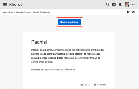
On the Blog Dashboard, Forum Dashboard, Event Dashboard, Ideas Dashboard, Knowledge Base Dashboard templates, and any of the content type templates (Blog Post, Forum Discussion, and so on), you can add and configure the Create Post Button widget to enable members with appropriate permissions to create content in that particular place. Button style Designate whether you want a Standard, Large, or Hero style button in the widget. Button width and alignment For the width, select from the following options: Width of label: The button’s width spans the width of the action text on the button. Width of column: The button spans the width of the column where the widget lives. When you select Width of label, you can select an alignment of left-justified, centered, or right-justified. Button label With the Button label field, you can rename the button in the widget. The text for this button defaults to the terminology for the content type associated with the page template where the widget is placed. For example, on the Blog Dashboard, the button says Create a Post, while on the Knowledge Base Dashboard, it says Create an Article. 148ViewsSign in to react to this post
 0Comments
Aurora: Guides widget configuration
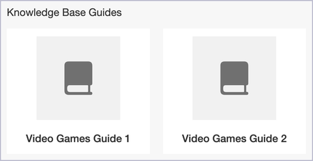
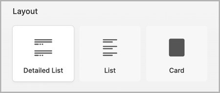
The Guides widget appears on the Knowledge Base Dashboard page template in communities that use the KB Guides feature. The KB Guides feature also enables you to turn on or off guide navigation (table of contents) on the Knowledge Base Article template. To learn more about KB Guides, refer to About KB Guides. Type The KB Guides feature enables you to organize your content either by Guides or by Manually-sorted Articles. Guides: Create a hierarchical structure for listing and ordering articles into Guides and Chapters to enhance organization, improve navigation, and provide a more structured learning experience for users. Manually-sorted Articles: Manually sort knowledge base articles on the KB board in Manage Content > Guides by dragging and dropping them into the desired order. This enables members to view and navigate the content in the sequence you prefer. Layout If you choose Guides for the Type, you can select from the following Layout options: List Card If you choose Manually-sorted Articles for the Type, you can select from the following Layout options: Detailed list List Card Configuration options List style The available List style options for Detailed list and List include: Space: Uses whitespace to create space between items. Divide: Adds a horizontal line to divide items. Border: Creates a border that separates items into individual boxes. Card size and text alignment If you select Card as the Layout type, you can set the Card size (Small, Medium, or Large) and the Card text alignment. Widget title The Widget title sets the title that appears at the top of the widget. If the Visible only to screen readers toggle is enabled, the title remains hidden to most visitors; however, the title information is still relayed to visitors using screen readers. Number of items Use the slider to indicate how many articles or guides (up to 20) can be displayed on the widget. List item/card elements Elements are additional pieces of information that can be displayed along with each item in the widget. The list of available elements changes depending on which layout you've selected. Guides Layout options Description: Description of the KB Guide defined in Manage Content > Guides for the knowledge base Avatar: (Card only) Knowledge Base content type avatar or avatar defined in site structure Manually-sorted Articles Layout options Author: Username of the author of the article Body preview/teaser: (Detailed list and Card) Preview text for the article Image preview: (Detailed list only) A preview of any image(s) in the article Centered card content: (Card only) Article content is centered on the card Media preview: (Card only) Preview of any media included in the article Place: (Detailed list and Card) Board where the article lives Reply count: (Detailed list and Card) Total number of replies to the article Tags: (Detailed list and Card) Any tag(s) associated with the article Timestamp: Time and date the article was published Unread message indicator: (Detailed list only) Total number of unread posts or comments on the article (for example, "1 unread"). View count: (Detailed list and Card) Total number of views the article has received Like count: (Detailed list and Card) Total number of likes the article has received Author rank: (Detailed list and Card) Rank of the author of the article Detailed list and List layouts have an additional Lead with drop-down menu. It enables you to choose to display the item author's Avatar, discussion style Icon, or None along with the item in the widget. Max lines of description text The Max lines of description text slider gives you control over how many lines of text from the post are displayed along with the post in the widget. After the set number of lines, an ellipsis (...) is used. More options Additional options are available at the bottom of the Edit Widget panel: Hide if empty: Hides the widget if there are no articles or guides to be displayed. Include “More Guides” link: Adds a link to the bottom of the widget to enable visitors to display additional items once the Number of items has been reached. Configuring the Knowledge Base Article content widget In communities that use the KB Guides feature, the Knowledge Base Article widget on Knowledge Base Article templates can be configured to show the guide navigation. To configure the Knowledge Base Article widget for KB Guides: In Designer, go to the Knowledge Base Article template where you want to adjust the widget. Locate the Knowledge Base Article widget and select Settings (gear icon). In the Edit Widget panel, below Guides, turn on or off Show guide navigation. With Show guide navigation on, guides appear on the article page within the widget. With Show guide navigation off, the widget appears as though you do not have the KB Guides feature enabled and does not show a table of contents.907ViewsSign in to react to this post0CommentsAurora: Featured Idea Statuses widget configuration
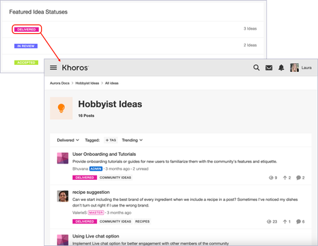
The Featured Idea Statuses widget displays the idea statuses you choose to feature and is available on the Ideas Dashboard page template. If you reset the layout of a page with a populated Featured widget or delete a section containing a populated Featured widget, that Featured widget is deleted from all other page templates on which it appears. If you attempt to reset or delete, you will receive a warning that also indicates all other places where the widget is located. When members access the widget in the community, they can click the status name to view the All ideas page scoped to that status. Layout The Featured Idea Statuses widget includes the List and Card layouts. From the Edit Widget panel, select one of these options to change the layout. List The List layout gives you a simple view of the statuses featured in the widget along with the number of ideas (if chosen to be included) associated with each status. Card The Card layout showcases the idea’s status name in the center of the card with, if chosen to be included, the idea count of each status displayed above the status name. Configuration options List style The options in the List style section for List layouts are the following: Space: Uses whitespace to create space between items. Divide: Adds a horizontal line to divide items. Border: Creates a border that separates items into individual boxes. Widget title Enter a title to appear at the top of the widget. If the Visible only to screen readers toggle is on, the title is relayed only through screen readers. Edit Sample Featured Idea Statuses Click Edit Sample Content to open a window where you can select sample idea statuses to preview how the widget will look in the community. Click Add Status to add statuses you want to feature one by one. You can then reorder the content by grabbing it with your cursor and dragging it to the desired location. Note: The sample statuses you select here are not saved or published to the community. You must add the actual idea statuses you want to feature on the desired page in the community. There is no global source for adding places that would apply it to every instance of the widget. See Feature content, places, and idea statuses on a page. Click Preview to return to editing the widget. List item/Card elements List item elements and Card elements determine what information is included for each item in the widget. Turning off or on the toggles hides or shows the elements. In this case, you can turn on or off the indicator for the number of ideas with the Show idea count toggle. Number of items The Number of items slider enables you to indicate how many idea statuses can be displayed on the widget. More options Additional options are available at the bottom of the Edit Widget panel: Include "Show More" link adds a link to the bottom of the widget to enable visitors to display additional items once the Number of items has been reached. Related topics: Feature content, places, and idea statuses on a page659ViewsSign in to react to this post0CommentsAurora: Event Board Information widget configuration
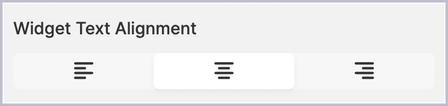
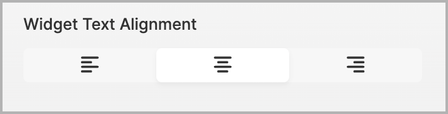
The Event Board Information widget displays basic information about the event board. It is available in the Event Dashboard page template. Widget Text Alignment The Widget Text Alignment area of the widget's settings menu enables you to set the alignment of content inside the widget to either the left, center, or right side of the widget. Widget Elements The widget includes a series of elements that showcase different information about the event board. You can switch these individual elements on or off using the following toggles: Widget Title: The title that appears at the top of the widget. Avatar: The event board’s designated image or default icon. Description: A short description of the event board as defined in the board's settings. Event Count: The number of events currently published in the board. Latest Activity Date: A display of the time since the last activity on any events within the board. Follow Action: A call-to-action button that enables visitors to follow the board directly. Follower Count: A total number of members subscribed to the board. Max lines of description text Use the slider to set up to 20 lines of text for the event board’s description.528ViewsSign in to react to this post0CommentsAurora: Suggest an Idea widget configuration
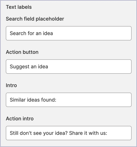
The Suggest an Idea widget enables members to search the community for previously submitted ideas that are similar to their own idea. This prevents duplicate suggestions from being submitted to your Ideas board. This widget is available only on the Ideas Dashboard template. Text labels For this widget, you can customize the verbiage for these text labels.: Search field placeholder: The text placeholder in the search field prior to the member entering any of their own text (the default text is “Search for an idea”). Action button: The text on the button displayed below the search results that enables a member to suggest their idea after they’ve searched for similar ones (the default text is “Suggest an idea”). Intro: The text that is displayed after an idea has been entered in the search field (the default text is “Similar ideas found:”). Action intro: The text that is displayed below the results list after a search (the default text is “Still don't see your idea? Share it with us:”). Results list style The widget supports these list styles: Space: Uses whitespace to create space between search results. Divide: Adds a horizontal line to divide search results. Border: Creates a border that separates search results into individual boxes. Number of results to show The Number of results to show slider sets the maximum number of results to display after a member conducts a search. If Show results pagination is enabled, members can click a Show More link to see more results. Show sample results You can enable the Show sample results toggle to preview what the search results may look like in your community. This content is chosen randomly from available ideas. Note: If no ideas have been posted to your Ideas board, there is no sample content to preview. Search result item elements You can choose to show or hide the following elements on the Search Before Post widget: Author: The author's name. Author Rank: The rank of the author. Comment/reply count: The number of comments or replies on the idea. Idea status: The status of the idea (see About idea statuses). Tags: Any tag(s) associated with the idea. Preview text: Preview text for the idea (length defined with the Lines of preview text to display slider). Timestamp: The time and date the idea was published. Unread count: The total number of unread posts or comments on the idea (for example, "1 unread"). View Count: The total number of views the idea has received. Vote display From the Vote display drop-down menu, select one of the following widget display options: Vote on Ideas: With this option enabled, members can vote on ideas directly in the Ideas widget. Show Count Only: With this option enabled, members see only the count of votes on an idea. None Lead with From the Lead with drop-down menu, select an option that designates what to show along with the idea in the widget: the idea author's Avatar the content type Icon None Lines of preview text to display The Lines of preview text to display slider gives you control over how many lines of text from each idea are displayed in the widget. After the set number of lines, an ellipsis (...) is used. More options Additional configuration options for the widget appear in the More options section: Include "Show More" link: Creates a Show More link if more ideas are available than the number designated on the Number of results to show slider.614ViewsSign in to react to this post0CommentsAurora: Events widget configuration
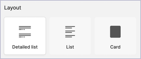
The Events widget provides a list of events in the related Event board. It is available on the Events Dashboard page template. Layout The layout options available for the Events widget are Detailed List, List, and Card. From the Edit Widget panel, select any of these options to change the layout of the selected type. Each layout has its own set of options. Detailed List The Detailed List layout features a smaller thumbnail accompanied by each event's title and any chosen elements. List On the List layout, each event is displayed in a list with its title and any chosen elements. Card With the Card layout, each event is displayed on a tile with its title and any chosen elements. Configuration Options List style The available options in the List Style section for the Detailed List and List layouts include: Space: Uses whitespace to create space between items. Divide: Adds a horizontal line to divide items. Border: Creates a border that separates items into individual boxes. Text alignment When you select the Layout of Card, you can also choose whether to align the card content to the left or center. Widget title The Widget title sets the title that appears at the top of the widget. If the Visible only to screen readers toggle is turned on, it is relayed only to visitors using screen readers. Number of items Use the slider to indicate how many events (up to 20) can be displayed in the widget. Sort and Filter In the Sort and Filter section, you can manage sorts and filters and indicate whether members can use them. Click Add to add the following SORT (tabs) or FILTER (drop-down menus and tags) options to the widget: SORT Most Recent Newest Events Most Likes Most Viewed FILTER Past Toggle on or off the Show filter and sort controls toggle to show or hide from members the filter tabs or the sort drop-down menus in the widget: Lead upcoming and past events with From the Lead upcoming and past events drop-down menu, select one of the following: the author’s Avatar the Event Date on a calendar icon the default event content type Icon None List item/Card elements Elements are additional pieces of information that you can turn on to be displayed in the widget. The list of available elements changes depending on which layout you've selected: Attendance indicator: Indicates whether the current member has responded “Attending” to the event. Attendee count: The number of people who responded “Yes” to the event. Author: The creator of the event. Author rank: The rank of the creator of the event. Comment/reply count: The number of comments and replies on the event. Event date: The date and time of the event. Event type: Indicates whether the event is In-Person, Online, or both. Like count: The number of likes on the event. Preview image: A preview of any media in the event description. Preview text: A preview of the event description text. Tags: Tags associated with the event. Timestamp: Indicates how long ago the event was created. View count: The number of times the event has been viewed. Lines of preview text to display The Lines of preview text to display slider gives you control over how many lines of text from the description are displayed along with the event in the widget. After the set number of lines, an ellipsis (...) is used. More options Additional configuration options for the widget include: Hide if empty: If there are no events to show, the widget is hidden. Show pagination: Creates a Show More link if more events are available than the number designated on the Number of items slider.697ViewsSign in to react to this post0CommentsAurora: Duplicate templates to customize individual community places
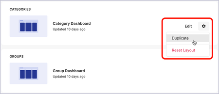
In Aurora, you can duplicate existing templates in order to customize them to fit the needs of specific community places. For example, it’s possible that you have multiple blogs using the Blog Dashboard template and that you’d want a different banner image on each of these blog pages. With template duplication, you can do just that. To duplicate a page template: Go to Designer > Page Templates. Hover your cursor over the page template you want to duplicate and open the Settings (gear icon) menu. You can also duplicate the template from the Settings menu located at the top of the template edit page. Click Duplicate. In the Duplicate Page Template window, complete the following fields: Name: Enter the name of the duplicate template. It is preceded by the name of the original template automatically. Use in these places: Open the place picker and select the specific places that will use this duplicated template. If you do not select any places in this window, you can adjust them later when editing the page template. When editing, use sample content from: Open the place picker and select the place whose sample content you want to see when you’re editing the duplicated template. If you do not select any places in this window, you can adjust them later when editing the page template. Click Duplicate. After the page template is duplicated, hover your cursor over that template and click Edit. mplate.png Style and organize the duplicated template as desired to fit the place(s) where you want to use it. If you want to modify the places that use the duplicated template, open the Settings menu (gear icon) and click Settings. In the Use in these places field, select the specific places that will use this template. Publish your changes to see them in the community. The changes you made to the duplicated template apply only to the places you choose to tie to that template. Notes: You can duplicate a duplicated template by opening the Settings menu and clicking Duplicate. If you no longer need the duplicated template, on the edit page, you can open the Settings menu and click Delete. In the delete confirmation window, all places that use this template are listed so you know which places are affected. If you delete a duplicate of a duplicate, you are given the option to select which page template the places that were using the now-deleted template will use. Otherwise, places revert to using the original page template. You cannot reset the layout for a duplicated template since the reset layout would be the original version of the template. Related topics: About Page Templates Using Page Templates Create and arrange sections in a page template Getting Started with Widgets627ViewsSign in to react to this post0CommentsAurora: Related Content widget configuration
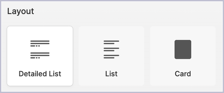
The Related Content widget displays content that is similar to the content currently being viewed. It is available on the Forum Discussion, Blog Post, Knowledge Base Article, and Idea page templates. Layouts The layouts available for the Related Content widget include Detailed List, List, and Card. Each layout has its own set of unique options. The Detailed List layout features a smaller thumbnail accompanied by the post’s title, elements you choose to include, and a preview of the post’s content. The List layout includes a thumbnail, title, and elements you choose to include but no content preview. The Card layout puts each post on a tile with the title, elements you choose to include, and a content preview. Configuration Options List Style With the Detailed List and List layouts, you can also select a List Style: Space: Uses whitespace to create space between items. Divide: Adds a horizontal line to divide items. Border: Creates a border that separates items into individual boxes. Title The Title sets the title that appears at the top of the widget. If the Visible Only to Screen Readers toggle is turned on, the title remains hidden to most visitors; however, the title information is still relayed to visitors using screen readers. Number of Items Use the slider to indicate how many posts (up to 10) can be displayed on the widget. List Item/Card Elements Elements are additional pieces of information that can be displayed along with each item in the widget. The list of available elements changes depending on which layout you've selected. Turn on or off the elements as desired. Detailed List and List layouts have an additional Lead With drop-down menu. It enables you to choose to display the post author's Avatar, discussion style Icon, or None along with the post in the widget. Detailed List Author Author Rank Body Preview/Teaser Media Preview Like/Vote Count Place Reply Count Tags Timestamp Unread Messages Indicator View Count Time To Read (Blogs only) Solved Badge (Discussions only) List Author Timestamp Card Author Author Rank Body Preview/Teaser Centered Card Content Reply Count Media Preview Like/Vote Count Place Tags Timestamp View Count Time To Read (Blogs only) Solved Badge (Discussions only) Max Lines of Preview Text The Max Lines of Preview Text slider gives you control over how many lines of text from the post are displayed along with the post in the widget. After the set number of lines, an ellipsis (...) is used. More options Additional configuration options for the widget appear in the More Options section. These options include: Hide if empty: Prevents boards that have no posts on them from appearing in the widget. Include “Show More” link: Creates a Show More link if more posts are available than the number designated on the Number of items slider.668ViewsSign in to react to this post0CommentsAurora: Ideas widget configuration
The Ideas widget provides a list of ideas in the related Ideas board. It is available on the Ideas Dashboard and Idea page templates. Layout The layout options available for the Ideas widget are Detailed List, List, and Card. From the Edit Widget panel, select any of these options to change the layout of the selected type. Each layout has its own set of options. Detailed List The Detailed List layout features a smaller thumbnail accompanied by each idea's title, chosen elements, and content preview. List On the List layout, each idea is displayed in a list with its title and chosen elements. Card With the Card layout, each idea is displayed on a tile with its title, all chosen elements, and content preview. Configuration Options List style The available options in the List style section for the Detailed List and List layouts include: Space: Uses whitespace to create space between items. Divide: Adds a horizontal line to divide items. Border: Creates a border that separates items into individual boxes. Content alignment When you select the Layout of Card, you can also choose whether to align the card content to the left or center. Title The Title sets the title that appears at the top of the widget. If the Visible only to screen readers toggle is turned on, it is relayed only to visitors using screen readers. Number of items Use the slider to indicate how many Ideas (up to 20) can be displayed on the widget. Sorts and filters The Show filter and sort controls option enables the community member to filter the list of ideas by status and tag. In the Sorts and filters area, if you selected Detailed List for the Layout of the widget, you have the option to add multiple sorts and filters that appear on tabs or drop-down menus at the top of the list. Community members can click these to sort and filter ideas as desired. Click Add and select the ones you want to use. If you selected List or Card for the Layout, you have the option to select a single sort or filter option to organize the Ideas in the widget. Sorting options: Most Comments Most Recent Most Views Most Votes Newest Trending (combination of recency and number of votes) Status set filters: New In Progress On Hold Completed Closed The sort order for the status sets is always Most Recent. List item/Card elements Elements are additional pieces of information that you can turn on to be displayed in the widget. The list of available elements changes depending on which layout you've selected: Author Author rank Comments/reply count Idea Status Preview image Preview text Tags Timestamp Unread count View count Detailed List and List layouts have an additional Lead with menu. Select an option that designates what to show along with the idea in the widget: the idea author's Avatar the content type Icon None The Detailed List and Card layouts have an additional Vote display menu. Select an option from among: Vote on Ideas: With this option enabled, members can vote on ideas directly on the Ideas widget. Show Count Only: With this option enabled, members see only the count of votes on an idea. None Lines of preview text to display The Lines of preview text to display slider gives you control over how many lines of text from the Idea are displayed along with the Idea in the widget. After the set number of lines, an ellipsis (...) is used. More options Additional configuration options for the widget appear in the More options section: Hide if empty: Prevents boards that have no ideas on them from appearing in the widget. Include “Show More” link: Creates a Show More link if more Ideas are available than the number designated on the Number of items slider.711ViewsSign in to react to this post2CommentsAurora: Ideas Board Information widget configuration
The Ideas Board Information widget displays basic information about the related ideas board. It is available on the Ideas Board and Idea page templates. Widget Text Alignment The Widget Text Alignment area of the widget’s settings menu enables you to set the alignment of content inside the widget to the left, center, or right side of the widget. Widget Elements The widget includes a series of elements that showcase different information about the Ideas board. You can turn on or off these individual elements using the following toggles: Widget Title: The title that appears at the top of the widget. Avatar:The Ideas board's designated image or default icon. Description: A short description of the Ideas board as defined in the board’s settings. Post Count: The number of ideas currently published on the board, including completed ideas. Latest Activity Date: The amount of time since the last activity on any ideas within the board. Follow Action: call-to-action button that enables members to follow the Ideas board directly. Follower Count: A total number of members subscribed to the Ideas board (as long as it is greater than zero). Max lines of description text Use the slider to set up to 20 lines of text for the idea board’s description.478ViewsSign in to react to this post0Comments