Recent Activity
How We Built It: Access Signposting
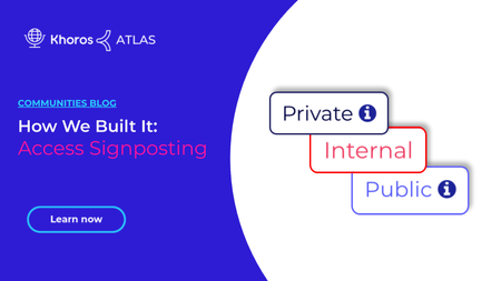
8 MIN READAtlas users have asked us how we built our customization that displays a fixed indicator (we call it a signpost) highlighting the access level of content on the current page being viewed. You can easily incorporate this customization into your community using the examples and source code in this article. Thanks to Claudius and AndyK for writing and sharing this customization! About the customization Make this your own Customization source code We built a custom component with FreeMarker that determines the right signpost to use based on the node in context. We use CSS to change the styling, text, and hover text based on the access level. About the customization The component logic First, we mapped out which nodes match which access levels we want to highlight (Public, Private, Internal, Registered, and Archive). We created a series of "if" statements using the OR comparison operator (||) to evaluate the node in context. If the page being viewed belongs to a node that matches the condition of the comparison logic, then we display the related access signpost. In some cases, we evaluate based on the current node's ancestors (container nodes in the Community Structure like a category or group hub). In other cases, we evaluate by node ID. For example, we want the Events category and all of its child nodes to be Public. In the snippet below, the comparison using coreNode.hasAncestor handles the case where the node in context is a child node within the Events category. The comparison using coreNode.id handles the case when the current node in context is the Events category Category Page: coreNode.hasAncestor("events") == true || coreNode.id == "events" Let's go a step further. This next snippet shows the logic we use to evaluate whether a node meets the "Public" access level criteria. This logic displays our signpost on the Events Category Page, all subpages in the Events category, and our Contact Support board. We create and style the signpost using the public-logo-link class. Note: We simplified the code in this snippet. See the full component source code at the end of this article. <#assign public = "" /> <#-- Define the Public criteria: The node being viewed must be the "events" node, a child node within the "events" node, or the "contact-support" node. --> <#if coreNode.id == "events" || coreNode.hasAncestor("events") == true || coreNode.id == "contact-support"> <#-- If the node in context meets the Public criteria, display the Public indicator with a Help icon that reveals a tooltip describing the access level on hover over. --> <span class="public-logo-link" title="Visible to the public including non-registered users.">Public <span class="lia-img-icon-help lia-fa-icon lia-fa-help lia-fa" aria-label="Help Icon" role="img" id="display"></span></span> Learn more about FreeMarker with Khoros C… 3.3KViewsSign in to react to this post
 15Comments
How We Built It: Author Stamps
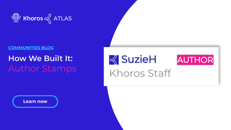
3 MIN READAs part of our ongoing series featuring customizations and solutions we’ve created for Khoros Atlas, this guide is going to give you a step-by-step breakdown of how you can add a colorful author stamp to comments and replies made by the original author of a blog post or message. In the above image, you’ll see a magenta stamp with the word AUTHOR in it. This stamp only appears for the original author of a blog post or message within their replies or comments. Creating this stamp is pretty simple. It involves the creation of a component, the addition of some custom styling, and the component’s placement on two item types. Step 1: Create the component The author-badge component needs to be created so we can place it in the appropriate places using the Quilt. Here’s the process: Navigate to Studio > Components within the Community Admin. Select New Component. Assign the new component the name author-badge . Drop in the following code snippet. <#if (env.context.message.author.id)?? && (env.context.message.parent)?? && (page.context.thread.topicMessage.author.id)??> <#assign userId = env.context.message.author.id /> <#assign topicMessageId = page.context.thread.topicMessage.author.id/> <#if (userId)?? && (topicMessageId)?? > <#if (topicMessageId)?? && userId == topicMessageId> <div class="author.badge"> <span class="badge1" data-badge="AUTHOR"></span> </div> </#if> </#if> </#if> Select Save to create the new component. The snippet performs several important tasks. First, it captures the ID of the author and message. If the author ID matches the ID of the author of the message, the component displays a stamp with the word AUTHOR . That badge’s styling is provided by the author.badge and badge1 classes. Step 2: Add custom styling to the skin The next step involves locating the skin your site is currently using, and editing the _styles.scss file to include new styling for the stamp. Here is how you can accomplish this: Navigate to Admin > Display > Skins within Community Admin. Take note of the skin currently being used. This skin has a filled-in radial field next to it on the list. Navigate to Studio > Community Style. Locate the current, active skin in the sidebar and select it. Select the CSS tab. Under sass in the file tree, choose the _style.scss file. Add the below snippet to the stylesheet. .badge1 { position:relative; padding-left:2vh; } .badge1[data-badge]:after { content:attr(data-badge); top:2px; right:3px; font-size:.8em; background:#E21A9A; color:white; width:40%; height:15px; text-align:center; line-height:18px; …3.5KViewsSign in to react to this post14CommentsHow We Built It: Private Member Info component
13 MIN READWe all know that protecting Community users' personal information is vital. That's why the most sensitive user profile data is visible only to users with the Administrator role. That said, a few profile fields enable Khoros staff members to troubleshoot questions better and help customers more effectively. On Atlas, we allow a select set of Khoros employees to see a user's email, company, first name, last name, and roles in a Private Member Info component. We display this component on the View Profile Page. Clearly, we don't want every Khoros employee to see this protected data. Therefore, we display the component only to users with a specific role. Today, we're going to walk through how our Atlas engineers built the Private Member Info component. Component workflow APIs used Code walkthrough How I tested it Custom CSS Annotated component code Component workflow The logical flow of our Private Member Info components looks like this: APIs used Our Private Member Info component uses FreeMarker context objects to make requests to the Community REST API. These are the FreeMarker and Community APIs we use: Freemarker restadmin - to make a request to the Community REST API as an administrator restBuilder - to build and send a LiQL query as a request to the Community REST API page.context.user - to get information about the user associated with the user profile page being viewed user.id - to get the ID of a user Community REST API v1 /users/id/{id}/roles - to retrieve roles for a user /users/id/{id}/settings/name/{setting-name} - retrieve the value of a setting /users/id/{id}/profiles/name/{profile-field-name} - retrieve the value of a user profile field Code walkthrough I'm going to walk through our Private Member Info component section by section. You can check out the full component code with annotations and our custom styles at the end of the article. Determine whether a user meets the requirements Retrieve data for the profile being viewed Component styling Display the email and verification indicator Display first and last name Display company name Display roles Determine whether a user meets the requirements For this component to render, the user viewing the page must be registered and must have the Staff role assigned. The goal of this snippet is to verify that the user viewing the page meets these requirements. 1 <#if user.registered> 2 <#assign isStaff = false> 3 <#assign roles = restadmin("/users/id/" + user.id?c + "/roles").roles.role> 4 <#assign roleSize = roles?size> 5 <#if (roleSize > 0) > 6 <#list roles as role> 7 <#if role.name?trim == "Staff"> 8 <#assign isStaff = true> 9 </#if> 10 </#list> 11 </#if> Line 1: We call the user.registered FreeMarker method to determine the registrat…1.9KViewsSign in to react to this post13CommentsHow We Built It: Atlas Custom Header
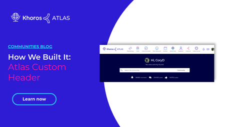
4 MIN READWith the latest Atlas redesign, we reimagined our Community header to build a more intuitive navigation and search experience. Learn more about our redesign in Atlas Redesign Project Story. Our custom header experience differs depending on: whether the user is anonymous or registered whether the user is on a desktop or a mobile device whether the user is on the Community Page or any other page in Atlas the user's role(s) in the community This article includes a zip file with our commented source code for the components, functions, macros, and CSS we used to build our customization. Let's look at the different ways the header renders depending on user, device, and page. Anonymous view (Desktop) Anonymous users have limited access to Atlas. You'll notice that some areas, such as the Dev Network, are not accessible to anonymous users at all. Registered user view (Desktop) Registered users see all menu items that they have permission to view based on their role(s) in Atlas. Notice that the registered user in the gif below has many more options than our anonymous friend above. Mobile/Tablet view Roles determine what menu items appear in mobile or tablet navigation, just as they do in a desktop viewport. The mobile/Tablet header uses the out-of-the-box Community Navigation (Slide-out) component, which uses a hamburger menu control. Community Page view (Desktop) The Atlas landing page (the Community Page quilt) includes a hero component with a search box. When the search box in the hero is in view, we don't include a search bar in the header. Once the user scrolls past the hero component, the search icon appears. This behavior uses JavaScript injected to our custom header component via the liaAddScript FreeMarker directive. Learn more about liaAddScript. Non-Community Page view (Desktop) On all other pages, the header includes the search icon and expanding/collapsing search box. Customization source files Our source code is in a zip file attached to this article. To keep our component code easier to understand, we separate the business logic code for creating the different sections of the navigation menu into separate functions and macros outside of our custom header component (custom-new-header.ftl). This makes it easier to read and understand the display that builds the header within the component code. You'll find these files in the attachment: custom-new-header.ftl - the component that renders the Atlas header theme-lib-common-functions.ftl - a macro that includes common functions used throughout Atlas customizations function executeLiQLQuery - logic to run LiQL queries and define the response format new-header-util-macro.ftl - a set of macros specific to the Atlas header customization function getUserInfo - gets a user's role(s) in the Atlas community and sets the role data in the user cache macro renderMainMenu - contains the logic…3.5KViewsSign in to react to this post9Comments2022 Kicks Off With Big Updates to Dev Docs
4 MIN READ2021 was an incredible year for the Khoros developer community. We incorporated new products and companies into our developer experience, refined navigation throughout our Developer Docs Portal (DDP). We introduced new features to help visualize use cases and demonstrate best practices. 2022 is set to be even better, with a ton of new features and improvements set to roll out early in the year. A refresh of our documentation's visual design, API reference tools, and an abundance of new content are just some of the ways 2022 is set to be the best year yet for our developer community. Our Growing Team Our Developer Documentation team grew in 2021 with the addition of JavidH. Javid's years of experience and fresh insight have proven invaluable to our Khoros family. He's been working primarily with the Khoros Community and Khoros Flow Developer Docs Portals. Recipes One of the newest features of our DDP platform, powered by Readme.io, is Recipes. With Recipes, we can explore and break down complex API requests and code examples to give context to each individual object, field, variable, etc. Our team has plans to roll out recipes throughout 2022, covering a wide range of use cases, including individualized API request examples that demonstrate the power of our Khoros APIs. You can find some examples of our existing Recipes below: Create a Monitoring Bot (Care) Pass Conversation Control to Agent from Bot (Care) Create a Group Hub with an Avatar (Community) Navigation and UX improvements We took significant steps in 2021 to improve the navigation of our DDP. These include updating our home and category pages to simplify and shorten the navigation flow between the home page and your target content. In 2022, we are taking what we've learned from the initial rollout and applying it to a design overhaul, modernizing the look and feel of our documentation. The UX changes were based on customer feedback with internal and external developer documentation users. Thank you to the customers and internal Khoros teams that we interviewed during our research phase. And a huge thank you to our designer JhilikR and front-end developers ShikherM and AbhishekGu ! Streamlined landing page Up-leveled page feedback tools Persistent header and improved signposting Streamlined landing page Use one less click to get to the product documentation you're looking for. The streamlined hover menu removes the need for a stop at landing pages for each documentation set. Up-leveled Page Feedback Tools Many of you have used the Suggest Edit feature in the DDP Guide pages, but less have used our page feedback component – Did this page help you? widget where you can give a thumbs up or thumbs down vote and add comments so that we understand your rating. We've moved the page feedback widget to the top of the page so that it is move visible. Please give us your ratings an…967ViewsSign in to react to this post8CommentsHow We Built It: Since you were gone component
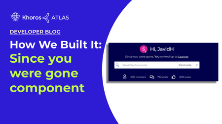
5 MIN READOverview This article explains how to build a custom component and attach it to the community hero element on your community home page. You can add this custom component to any element based on your preference. This custom component fetches recent notifications when the user is not signed in to the community. These recent notifications are rendered on your community home page based on whether the user is anonymous or registered. The purpose of this component is to notify visitors about recent activities performed on the user account for registered users and for anonymous users, a custom text based on your preference will be displayed. Building the Since you were gone component is done in three steps: Creating a custom component walkthrough Assigning the custom elements with custom text Adding the custom component to your community homepage Here is an image of the Since you were gone component in Atlas Community: Creating a custom component walkthrough Create a new custom component in Studio named since_you_were_gone (Studio > Component > New component). To add the below custom component code snippet, you must have community admin permission. <#if user.anonymous> <div class="hero-desc hero-desc-space-style"> <span>${text.format("custom.hero-desc.anonymous")}</span> <a href='${webUi.getUserRegistrationPageUrl("/")}'>${text.format("custom.hero-desc.anonymous.joinus")}</a> </div> <#else> <#assign notifications = rest("/users/self/notifications/unread/count").value?number/> <#assign notificationfeedCount = liql("SELECT count(*) FROM notification_feeds" )/> <#assign num=notificationfeedCount.data.count?number/> <#if (num> 0) && (notifications>0) > <div class="hero-desc hero-desc-space-style"> <div class="since">${text.format("custom.hero-desc.loggedin")}</div> <#attempt> <@component id="notificationfeed.notificationList" lazyLoad="true" /> <#recover> </#attempt> </div> <#else> <div class="hero-desc hero-desc-space-style"> <div class="hero-desc hero-desc-space-style">${text.format("custom.hero-desc.no.recent.notification")}</div> </div> </#if> </#if> We are going to break down the code into six sections. Section 1 (Line 1-6) <#if user.anonymous> <div class="hero-desc hero-desc-space-style"> <span>${text.format("custom.hero-desc.anonymous")}</span> <a href='${webUi.getUserRegistrationPageUrl("/")}'>${text.format("custom.hero-desc.anonymous.joinus")}</a> </div> <#else> If user.anonymous is true, then proceed. The remainder of the component code is contained in this if statement. If user.anonymous is not true, the…1.8KViewsSign in to react to this post7CommentsHow we built it: Search Anywhere and the Resource Center
4 MIN READIn 2019, the Customer Experience team at Khoros planned to improve the digital experience of our customers through a series of initiatives. One of the primary tasks was to make Atlas the focal point of documentation and support articles for Marketing products, just like it was for Care products. The change involved two steps: Moving all our product technical and functional documentation from third-party software to Atlas Maintain the ability to search for documentation from within the product websites i.e. search for documentation from Marketing and Care platforms from the in-app Resource Center What is the Resource Center? The Resource Center in this post refers to the tool powered by third-party software (Pendo) to house additional contextual help and include standard help articles or FAQs, as well as in-app Guides that will walk users through specific processes. Most of the existing Marketing customers were frequent users of the search within the app tool. So, it was important for us to retain this experience. However, these changes were due in less than two months, given the licensing deadline with a third-party application. This presented two key challenges: How to look up information from the Community? How to embed the Search Anywhere tool (yes, that’s what we named it internally) into the Resource Center and into the product website? How we solved looking up information from Community: Community platform supports the awesome API layer, known in developer circles, as LiQL - the Lithium Query Language LiQL enables you to search Community information based on tags, title etc. However, you must have the “correct” permissions via the API keys in order to pull the information The Triumph team built the oAuth based mechanism to provide the API access from a web application The premise was that we could register the Search Anywhere tool as an app on the Community platform and use the specific keys to make API calls and this is how it works currently A key feature that was necessary was to limit the ability to only lookup information limited to only certain “boards” (or nodes if you happen to know Community well). We achieved this by attaching a unique role, based on the application (Marketing or Care) We registered unique apps for Care and Marketing to “sandbox” access to relevant information within each of the products We needed the ability to show some posts by “default”, for example, if you land on the “Social Marketing” page in the Marketing product, the tool would show “top” posts from the “Social Marketing” board in our Community We achieved this using “tags”, a way to label the posts in Community. This required identifying and tagging the relevant posts in specific boards in the Community. Our Product Content Experience team helped with this laborious but important task. Going the extra mile -- Integrating Resource Center into Community and Community Analyt…894ViewsSign in to react to this post7CommentsKhoros Communities moves to The Cloud
7 MIN READPhoto by Alex Machado on Unsplash Nearly two years ago, the Khoros Communities Engineering organization began to move from co-located data centers to AWS cloud services. It's been a long process, but we're nearly complete. Technical Manager Aditya Pandurangi AdityaP , was kind enough to discuss the project with me. Q: Can you summarize what cloud services are and how Khoros Communities uses them? A: A cloud service, at a basic level, is a collection of many data centers that are spread across multiple locations and owned by a cloud service provider such as Amazon Web Services (AWS) or Microsoft Azure. The provider offers companies like Khoros a cloud-based platform, infrastructure, and storage services. In this case, the infrastructure to host and manage Khoros Communities. The cloud service provides a user interface or a set of APIs to request and manage specific hardware with the software of our choosing. The cloud service provider handles the hardware and maintenance, and we're in control of how we allocate resources. Before cloud services, companies had to have their own hardware located in a data center (either on-premise or in a colocated data center with multiple companies). This meant that companies managed the acquisition and maintenance of their own hardware in addition to managing network traffic and other management tasks. Handling hardware failures, hardware replacements, and physically moving the hardware was all in the company's purview. Khoros Communities, for example, had our own servers and equipment running in two data centers: one in Europe (Amsterdam) and one in the West Coast US (San Jose, California). In the cloud, we no longer worry about sourcing hardware, moving it physically, dealing with failures and outages, sourcing data center facilities, or paying data center storage rates. We don’t need to have Khoros employees add, remove, troubleshoot, and replace physical machines when we need more resources or if something breaks. In The Cloud™, everything is done for you. Q: Any downsides? A: There will always be sporadic hardware failures and restarts in the cloud that might temporarily make our services unavailable. That said, Khoros has built-in redundancy to handle failures as gracefully as possible. Also, the costs of using a cloud service over the long term are probably a bit higher because we don’t own the hardware and can’t amortize the cost over the duration of ownership. Despite those points, moving to the cloud is very much a net benefit. It’s allowed us to do cool, new things that we couldn't before, as well as offer our customers a better experience. Q: What does this migration mean for Khoros Communities customers? A. This migration enables us to provide flexibility to our customers in ways we couldn't before. We can now scale our resources to the needs of any customer. For example, some customers host large events where they see a 2-3x increase in traffi…1.6KViewsSign in to react to this post5CommentsAn Introduction to Aurora Technologies
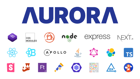
6 MIN READIntro Aurora is a game-changing update to the industry-leading Khoros Community platform, with powerful new tools to design and manage your community, create more engaging member experiences, and integrate community more fully into your digital ecosystem. In this article we’ll introduce you to the technology stack we used to create our next-generation Community application. Many of these technologies will be exposed as part of our new Software Development Kit (SDK) that will be used to customize the Community Application. This latest iteration is a complete reimagining of our UI technology stack, with some notable backend changes. Engineering Goals When we kicked off the Aurora project, we set some lofty engineering goals for ourselves. While many of these goals are consistent with our existing Community product, we wanted to double-down and ensure that from day one we adhered to these goals. High performance: Server-side rendered (SSR); only include JS and CSS that are used by the components on the page; measure web vitals and set aggressive thresholds for Largest Contentful Paint (LCP), First Input Delay (FID), Cumulative Layout Shift (CLS), and other common metrics like Time To First Byte (TTFB). Best-in-class Search Engine Optimization (SEO): Semantic web and well structured markup; proper JSON-LD and microdata to enable Rich Snippet results in Search Engine Result Pages (SERP); reimagined and configurable URL patterns - no more "t5" by default. Accessibility: Web Content Accessibility Guidelines (WCAG) at a target level between AA and AAA; automation and testing to ensure all new UI meet these standards. Built-in mobile support; We're not quite a "mobile-first" development shop, but mobile is a priority and will work seamlessly with all new out-of-the-box (OOTB) interactions. API driven: All UI for Community will be backed by public APIs, no more internal APIs that can only be used by Khoros. Delightful to work with: Fast, inspect-and-adapt loop for internal and external developers. Heavily extensible: Enable external developers, via our SDK, to use the same tools we use internally to build integrations and extensions to the core product. Developer Tools and best practices enable customers to create integrations that are upgrade safe, avoid conflicts, and provide simple ways to preview and test changes. Modern frameworks and libraries: Leverage best-in-class and open source frameworks to simplify development and modernize our user experience. Technology Stack This overview into the Technology Stack used by Aurora is broken down into logical layers consisting of Styles, Web, UI Server, Backend, and a brief mention of some ancillary Tools used to build Aurora. Styling Starting at the figurative top level, the technologies we use for Styling act as the front door for our end-users. Think of it as the brioche bun on our UI tech-stack-hamburger. Bootstrap “The world’s …2.9KViewsSign in to react to this post2CommentsWelcome To Our New Developer Blog
2 MIN READWelcome to our new Developer blog! It's our goal to not only create an excellent resource for news and information about our products that matters most to developers but to share insights and knowledge about software engineering from members of Khoros and our community at large. This includes top tips, API changes that matter to you, and success stories with insight into how you can get the most out of Khoros' APIs. At Khoros, we love our developer community. The backbone of any great enterprise is its engineering team, and we wanted to create a blog that speaks directly to developers. This means diving deeper into subjects that matter to engineers working with Khoros products, and providing useful information that goes beyond the high-level perspectives blogs with a wider audience are limited to. The goal of this blog is to not only share tips and tricks about our products, but to pass on some of the things our engineering teams have learned while creating them. Here are some of the types of posts we have planned to share: Feature/product highlights Development tips and tricks API updates Use cases and solutions Question and answer Success stories (both internal to Khoros and shared by customers) Upcoming updates and new features We're excited about the opportunity this blog provides us to speak directly to our developer community, sharing insight into some of the cool things we've been working on and how they will empower you to do even more. Want to Share a Post of Your Own? Have an idea? Do you have a success story or solution that you want to share? Please feel free to email us at [email protected] and let us know you'd like to submit a guest blog post. We would also be thrilled to receive blog topic suggestions so we can cover them in a future post.849ViewsSign in to react to this post2CommentsHow We Built It: Platform Status Banner
3 MIN READWhile we prefer the Khoros platform to be operational at all times, there are times when our product experiences a service disruption. When this happens, it is critical that we inform our customers. We do this by presenting a platform status banner in our Atlas Community. Here is an image example of the Khoros Platform Status Banner: We had some interest here to explain how we achieved this functionality. Let's get into the details! Since your systems will vary from ours, we have made the integration explanation more generic so that you can more easily adapt it to your needs. On its surface, this is a pretty simple feature. It is a custom component that conditionally shows markup based on a JSON response. That is what we will walk you through. Data Source Each product that we want to monitor has a data source that provides the operational status. For the Atlas status banner, Community, Care, Marketing, Flow, and CX Insights are all data sources. First, we need to connect to those data sources via an API. Like many SAAS companies, we use both internal and external monitoring services. You'll need to identify what monitoring services your company uses and find the API that returns the statuses you need. A sample response from a monitoring service could look like the following: [ { id: "SERVICE_ID" name: "SERVICE_NAME", platform: "PLATFORM_NAME" status: "operational", }, { id: "SERVICE_ID" name: "SERVICE_NAME", platform: "PLATFORM_NAME" status: "degraded_performance", }, { id: "SERVICE_ID" name: "SERVICE_NAME", platform: "PLATFORM_NAME" status: "major_outage", }, ... ] Now we need to interpret the above response and render our banner to your community page. Custom Component To display the operation status retrieved from the monitoring service, create a custom component in Community > Studio that displays the platform status banner with markup and Javascript (using the LiaAddScript FreeMarker directive). Markup In your new custom component, set up the markup you want to display in your community. Note that we have set display:none upon initial render. This hides the component until JavaScript logic (described later) determines if any products have a degraded service status to report. <div class="my-fancy-status-component-container" id="StatusComponent" style="display: none;"> <span class="status_container"> <span class="status-name">PLATFORM</span> <span class="status-separator">:</span> <span class="PLATFORM-indicator"></span> </span> <!-- ... repeat for other platforms --> </div> LiaAddScript In a <@liaAddScript>, make a request to fetch your data and modify your markup. <@liaAddScript> ;(function($) { $.ajax(…605ViewsSign in to react to this post1CommentHow We Built It: Custom Community Banners
5 MIN READCustom community banners are a great way to enhance the user experience throughout your Community. In Atlas, we use custom content to draw attention to important features, direct users to useful pages, and share news from our team. In this post, we take a look at some of the ways you can leverage Khoros Communities' Custom Content features to enhance your user's experience. You can customize Custom Content with a little scripting in several ways: Show or hide the component based on the user's role(s) Add CSS styling unique to the component Display images hosted externally or through your Community's Asset Library Direct users to a specific link or area of your Community In this example exercise, we're adding the banner (below) to our community's pages. We will go through the process of uploading the image asset, creating the custom content, and adding the Custom Content component to our Community Page's quilt. Upload Image Assets to your Community We start with a simple PNG image that we want to display in the custom community banner. This image file needs to be hosted somewhere. This could be an external hosting arrangement, or directly hosted from within your community using the Community Asset Library. You can upload image assets to the Asset Library by doing the following: Go to Studio > Community Style Tab. Select Asset Library from the Work With drop-down menu. Click the Other Assets tab. Click the Choose File button and select the file you want to upload. Click Upload. After you have uploaded the new asset, you can locate the file in the list and discover its unique URL. Make note of this URL since you will need it when crafting the Custom Content in the next step. In our example, our file is located at /html/assets/thankyou2.png. Add Custom Content to the Quilt This last step is pretty straightforward. We need to add our new Custom Content to the quilt for the page(s) we want the banner to appear on. In our example, we're adding it to the Community Page. Here's how: Go to Studio > Page. Expand the Custom Content area of the Components list. Select the Custom Content item you want to use for this banner by clicking the plus (+) symbol next to it as you hover over it with the cursor. Drag the Custom Content component to the area of the quilt in which you want the banner to display. Scroll down to the bottom of the page and click Save. Once you have configured the custom content, your new custom community banner should appear where you configured it to go and for the users with the role(s) you specify in the content's scripting. Create Custom Content Now that you have the image asset(s) you want to display in the custom community banner uploaded, you can create the custom content that the image(s) will be displayed through. Here's how: Go to Community Admin > Content > Custom Content. Select a Custom Content Setting that…976ViewsSign in to react to this post1Comment